Two MICHELIN Stars
Lazy Bear
6:457:308:15
Reserve for 7:30 PM
Built and scaled OpenTable's design system: shared tokens, component patterns, and contribution workflows across web and native platforms.
OTKit existed on paper but lacked cohesion, governance, and trust. The mandate: turn a drifting system into an operational platform teams actually relied on. It served three users at once.
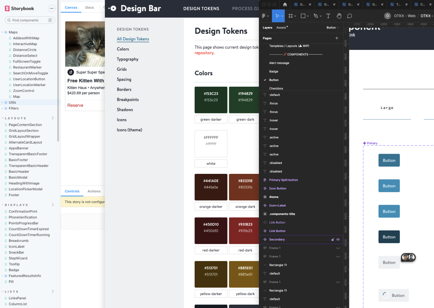
Drift was expensive and invisible. Three sources of truth — Storybook, Figma libraries, inline docs — were reconciled by hand, separately, per team, producing visual inconsistency across products and late-stage QA bugs tied directly to token and component mismatch.
We put the cost of drift at ≈$390K a year in visual QA time, across design and engineering.
Costed from a 37-person survey: ~5 engineering hours a week across 14 people (≈$273K), ~3 design hours across 10 (≈$117K), at $75/hour. Naming it in dollars is what made the work fundable.
The survey also found where it hurt most. 100% of iOS designers were creating one-off components often or occasionally, against 60% on web — unsurprising given a mature web library (Buffet) and nothing comparable for native. And 75% of Restaurant web designers spent 4–8 rounds per release clarifying styling with engineering, where 100% of Diner web designers needed 0–3.
I think iOS lacks the rich component system that web has (Buffet), and that poses some challenges for us.
Restaurant iOS engineer
Interviews surfaced the same thing from both sides: unclear documentation, scattered sources of truth, no shared component language. Much of the style guide lived in designers' heads.
Six teams were shipping in parallel, on legacy patterns embedded in production, across three platforms. Nothing could pause. So the order was tokens before components, accessible colour and typography first, and documentation treated as a system artifact rather than an afterthought — the layer teams could adopt inside an active codebase without a rewrite.
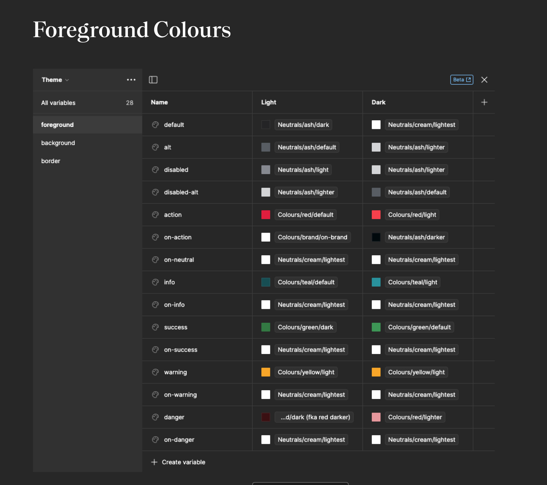
I audited every colour cross-platform, deprecated the redundant ones, and rebuilt the system around accessible semantic tokens with mixed light/dark theming for existing UI. That alone fixed actions that read as disabled and closed platform-parity gaps.
22 reservation statuses needed colour, plus data viz, plus white-label theming. Hyper-specific tokens read precisely but couldn't scale across two products, so statuses bind to the semantic accent ramps instead: eleven tokens carry all twenty-two states. Shipped on time, zero new colours.
Reservation status: Booked
The floor plan is the denser half of the same screen. Labels sit *on* the colour, so each tile pairs its fill with its own `foreground/on-*` token to stay legible.
Every label uses its background's foreground/on-* token — all 21 clear WCAG AA.
Each tile's label is its background's foreground/on-* token. The lighter drinks fills pair with foreground-default and course 4 uses a darker accent-teal, so every label clears WCAG AA — no new colors. Every glyph is the real OTKit vector.
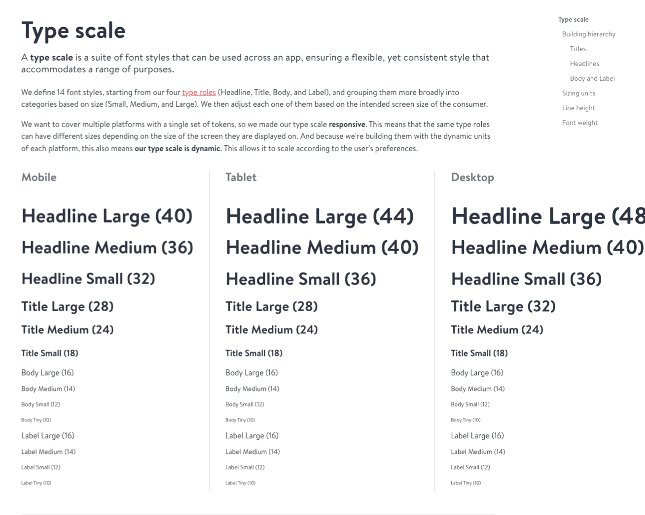
The old scale was one-size-fits-all: not mobile-optimized, encouraging incorrect font usage in native apps, and ballooned to 39 fonts in the codebase. The replacement was contextual — size, weight and family defined per platform context, plus Apple Dynamic Type, 44px minimum touch targets, and the same tokens as web. A/B testing showed a +2.19% increase in diner bookings, about +600 weekly net bookers, on pages using dynamic type.
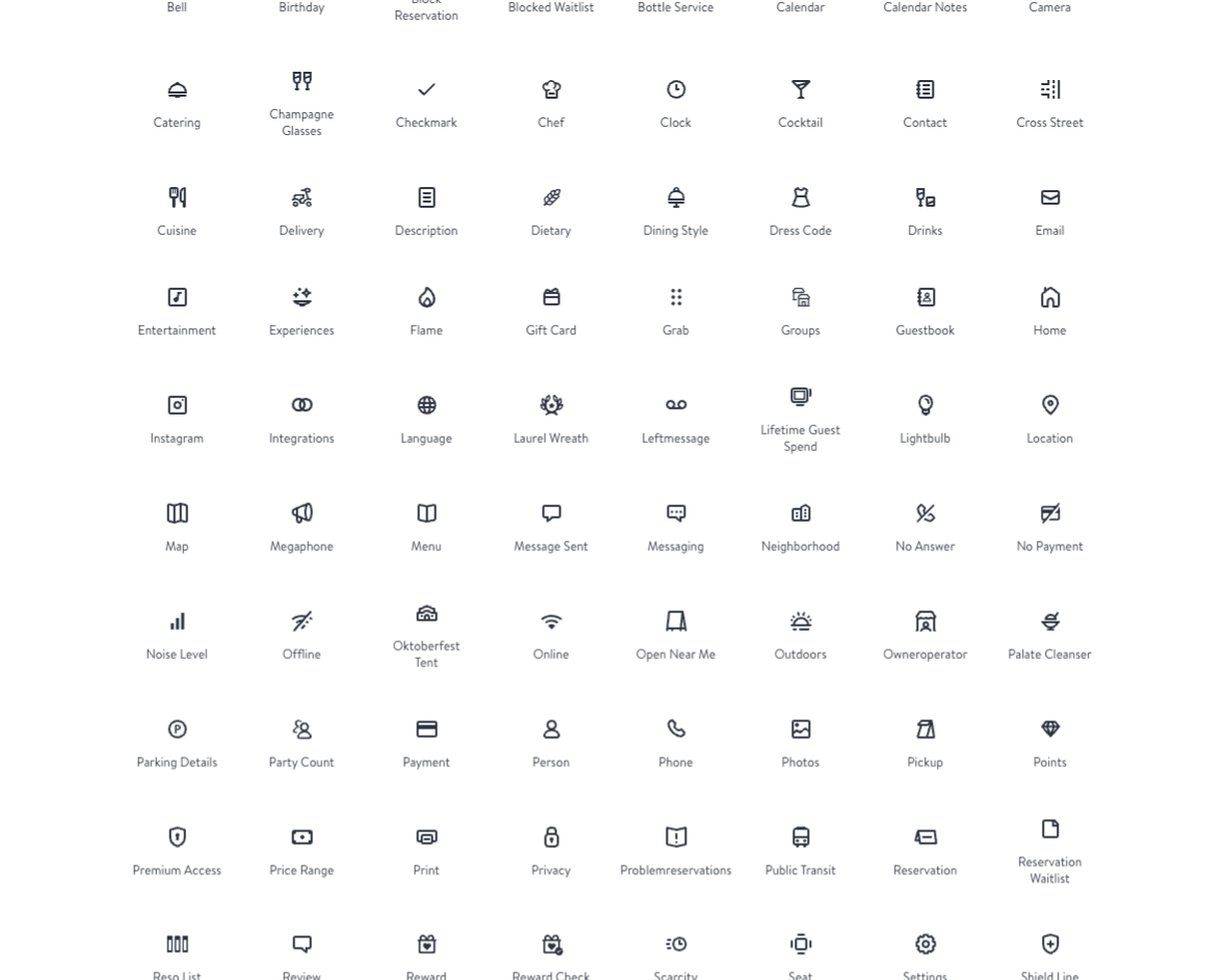
Shape-based grids gave one optical size and equal optical area across keyshapes, with the drawing rules set explicitly: 1.5px stroke replacing the deprecated 2.0, 2dp corners outside and square inside, unified keyshapes for indicators, centralized repositories, and SF Symbol parity for accessibility.
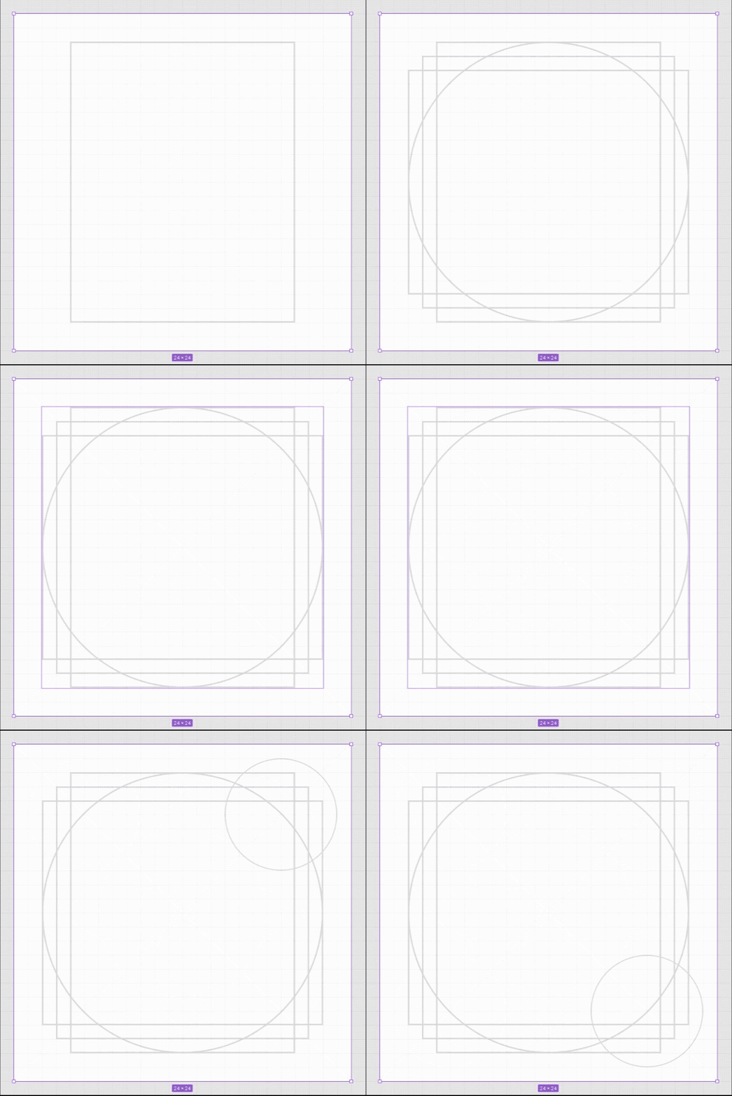
The rules had reasons. The 2dp outer corner echoes the OpenTable logo; detail is a function of size, answering a five-second recognition test, which is why 24px earns tick marks that 16px cannot afford. The result was a searchable, themeable SVG system shared across native and web.
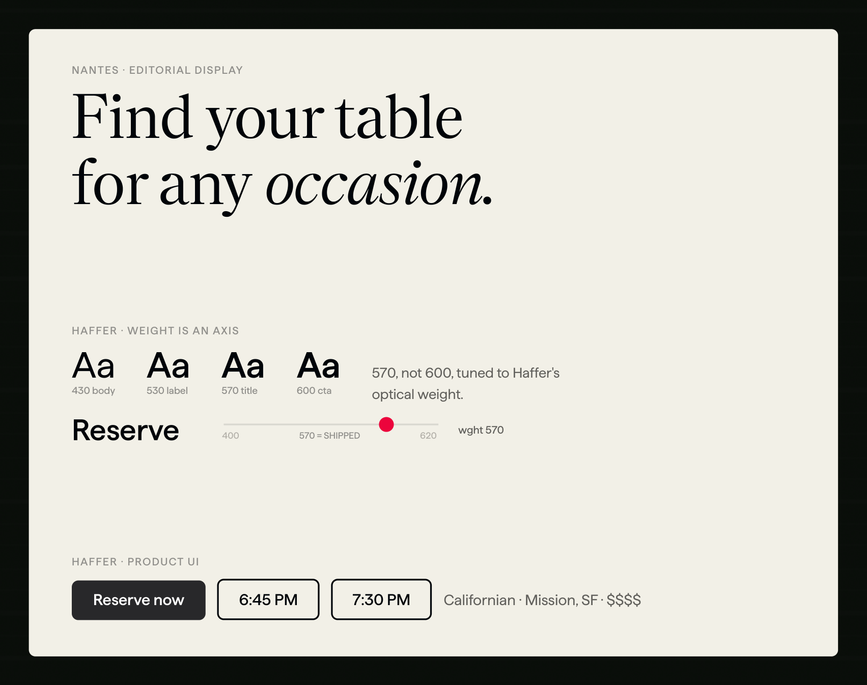
OpenTable competes in an industry drenched in red and orange. Partnering with Brand, we translated a premium direction into tokenized theming rather than one-off visual treatments: two new families (Nantes for editorial display, Haffer for product UI, Brandon retired), a refreshed palette, and visual distinction for Iconic restaurants.
Every text style already pointed at one family token, so the swap was a re-binding, not a redraw — two variable fonts replaced six static cuts. The one judgement call was the CTA: 570, not the 600 the old scale implied, tuned to Haffer's optical weight.
The name was the argument. Red meant error, and it was also our primary action: one hue doing two contradictory jobs. Black solved both, giving Iconic its elegance and freeing red to mean danger again. Every black-button state was checked against AA, not just the default.
Checking states instead of defaults is what turns up real problems. `background/action-hover` resolves to the lighter step of the brand ramp, so a white label on a hovered primary button measures 3.24:1 on Restaurant teal and 3.57:1 on Diner red. AA asks for 4.5:1 and makes no exception for hover. Only disabled controls are exempt. The demos on this page render the real token rather than a safer substitute, so that state fails here too, and this site's contrast gate reports it as an accepted failure rather than quietly passing.
Two MICHELIN Stars
Reserve for 7:30 PM
Brand collection · the only diff
bg-action#2D333Fbg-action-hover#575C66bg-action-pressed#141A26bg-alt#F2EFE66 variables re-point per brand. The other 278 are shared.
The button never names a brand — it asks for these; the collection decides what they resolve to.
Mass serves the core audience: editorial in feel, two-column, booking surfaced immediately. Iconic is the premium tier: full-bleed photography, dark wine-toned time slots, sticky booking. Same tokens, same components, different values — which is why the brand shift landed without teams rewriting anything.
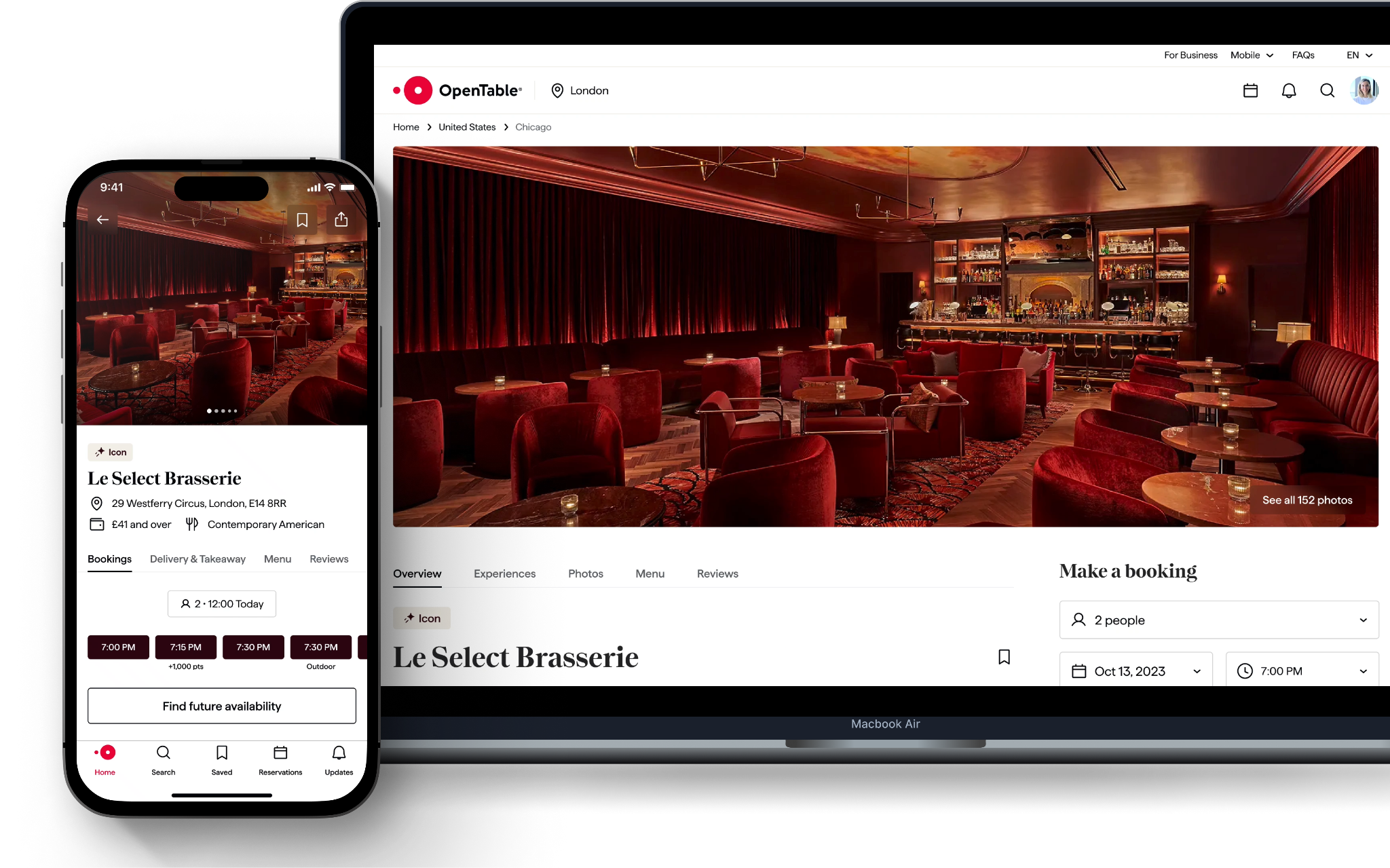
See it live: browse the Icons collection of premium restaurants, or open an individual Iconic restaurant page (Rich Table, San Francisco) to see the theme in production.
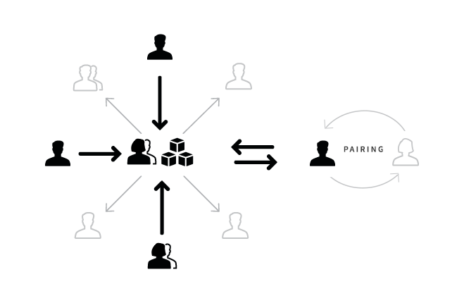
Two people can't scale to six teams — a designer–engineer pair per platform could. Each pair championed the system locally and carried friction back; contribution ran one path every time: propose, review, merge. That friction fed a quarterly roadmap to the director, keeping the cost of drift visible to the people funding it.
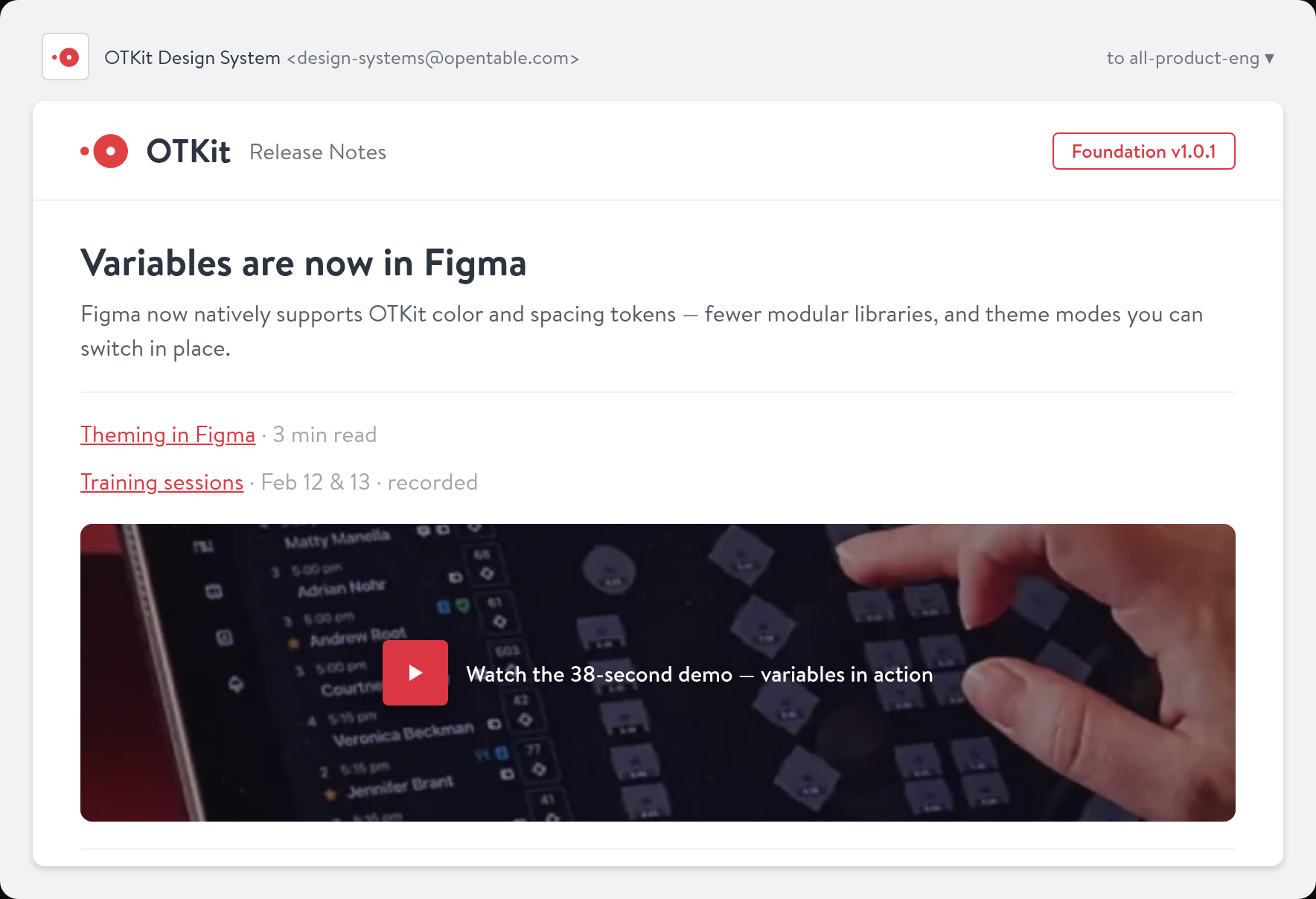
Slack buried system updates in noise, so every release shipped an email instead: what changed, why, a demo, how to migrate. Every other team started one after this. Trust came from follow-through — issues answered fast, breaking changes migrated for teams — and that turned skeptics into advocates.
I wanted to mention how helpful it has been having River support me on the design systems front. His depth of knowledge has been invaluable for our team.
Jordon · Restaurant Design Ambassador
The ≈$98K a year is that 25% QA reduction, priced against the $390K drift was costing. What actually changed was the mindset: the system became something teams relied on rather than worked around. That's the difference between a library and a platform.
We started before Figma shipped Variables, managing tokens through naming conventions and manual syncing; we migrated fast when Variables arrived, but the gap cost early momentum. With teams across North America, Europe and Asia, context didn't travel — the newsletter became the most effective channel and I'd have started it much earlier. And system work kept getting pulled into feature support; ambassadors helped but their hours were a real cost against product delivery. Formal sessions worked at first, but what drove adoption was loosening them into jams. I'd draw all three lines earlier.