Modernizing Restaurant Reservations Without Losing Density
Improved the restaurant reservation workflow: better hierarchy and scannability without sacrificing the information density power users depend on.
OpenTable's reservation details view was the most legacy-styled screen in the product: dense, fragmented, expensive to maintain, and used by operators every shift. I led the redesign. The brief was to modernize it without losing the density they rely on.
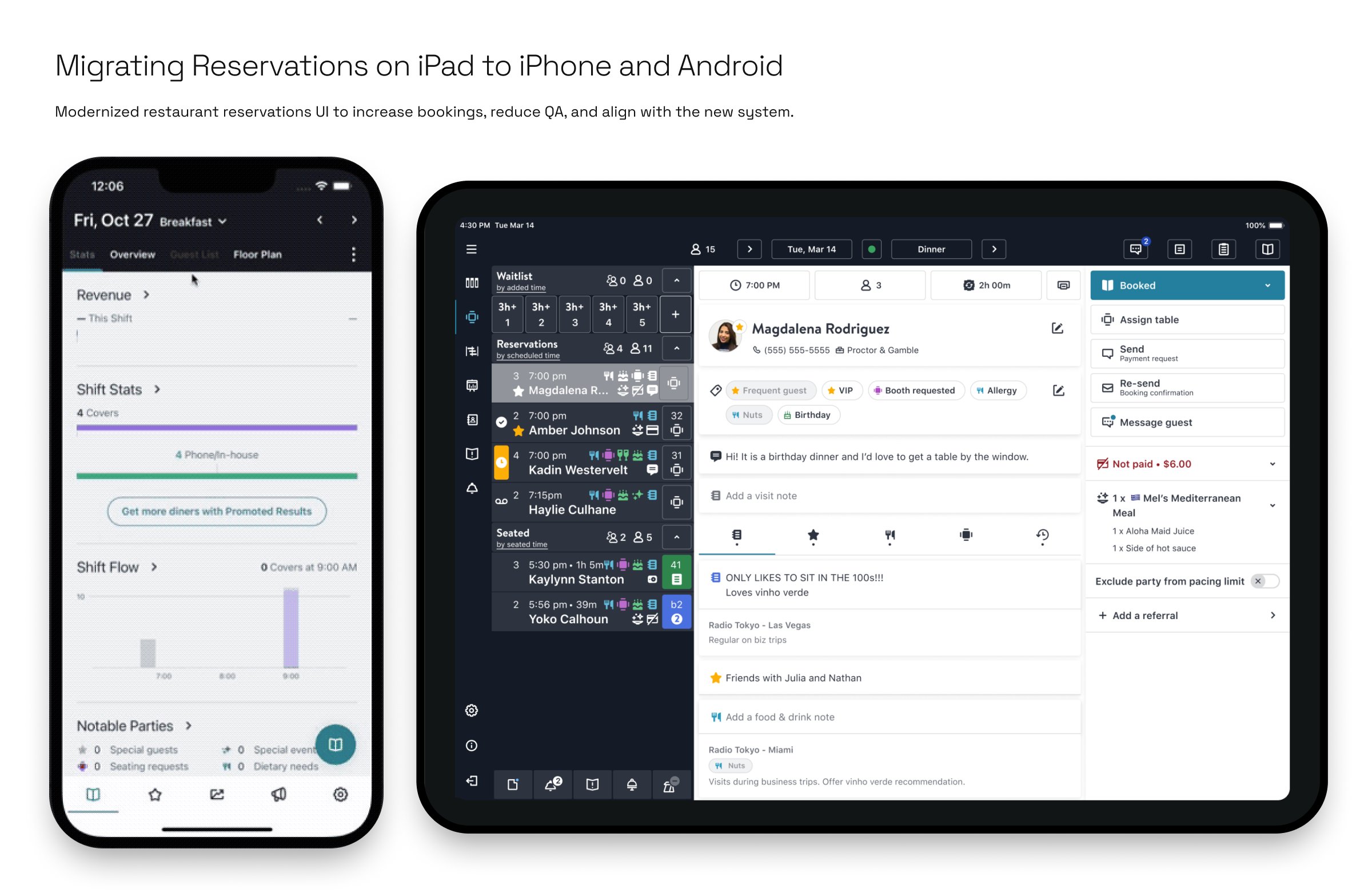
Three tempos, one record
The same reservation is read by three people at three speeds. The host at the door has seconds per guest, standing, on an iPad. Front of house runs the floor all shift on iPhone and iPad, watching live statuses, allergies and notes. Back of house returns to the same record between shifts on the web, slower and in more depth. Build the card once; let each surface decide how much of it to show.
That framing moved the product, not just the screen. The tool had stayed tethered to the host stand even though staff work the floor, not a desk. Mobile was designed first and iPad second, so one logic carried across both.
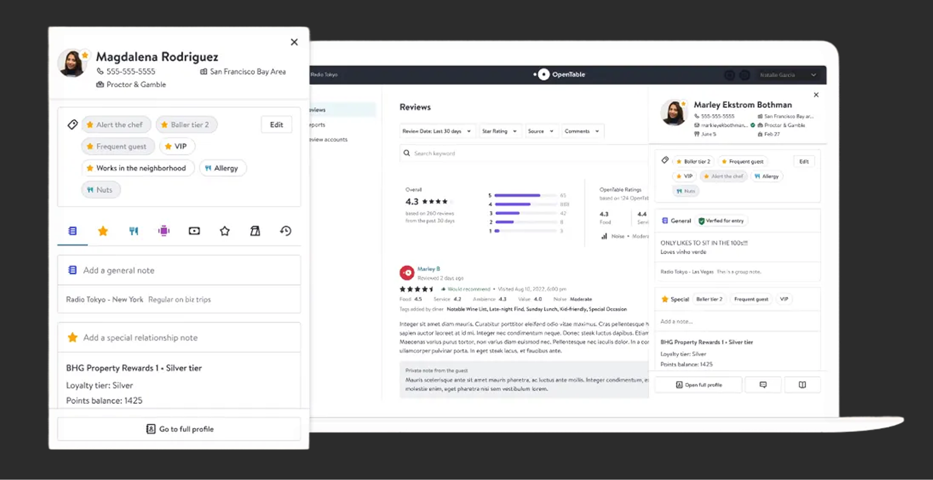
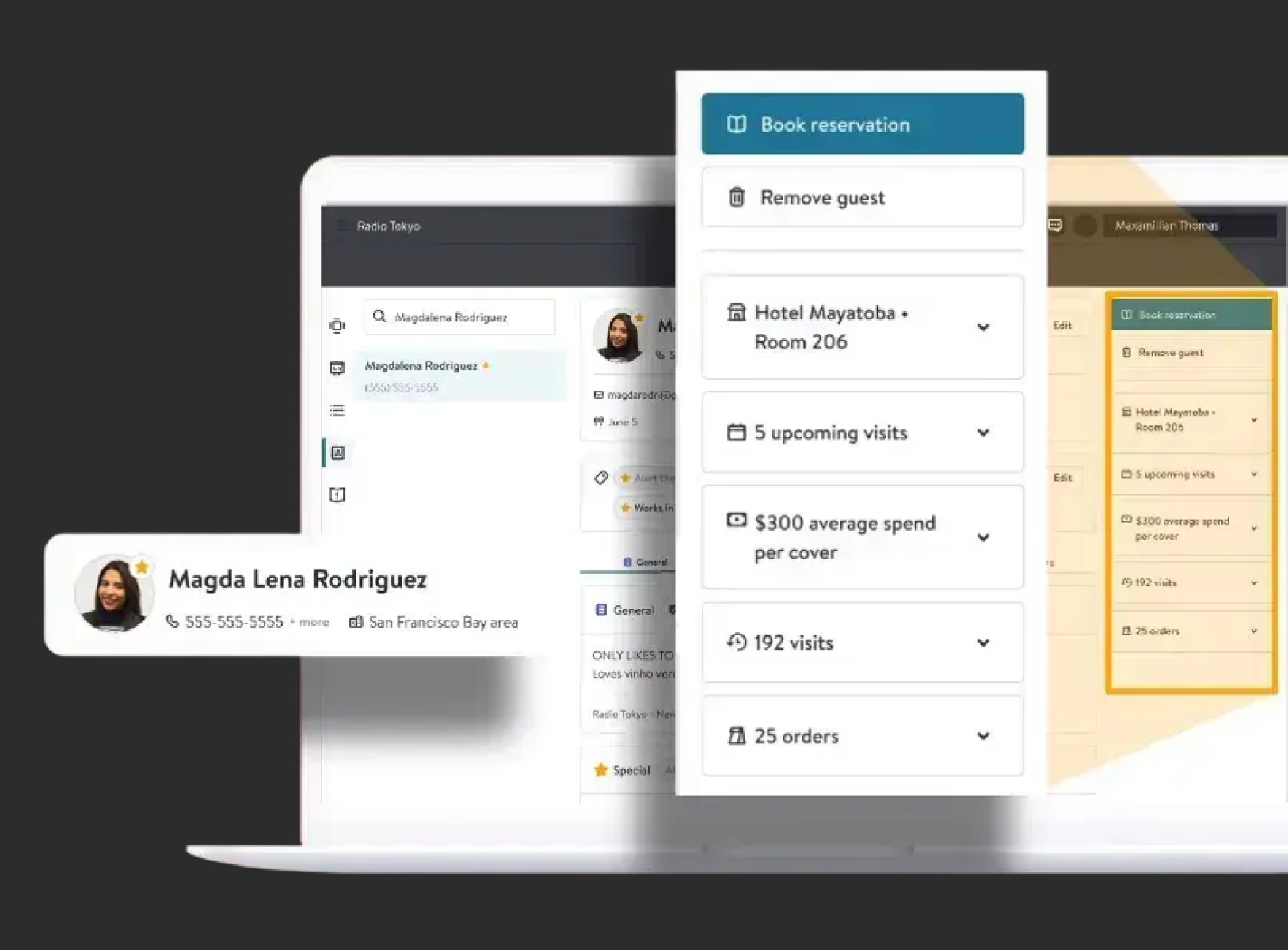
A dumping ground by accumulation
Years of shipped features had each found somewhere to live, and restaurants run their whole shift on the result. Guest details and visit history sat hidden behind tabs, so they were rarely seen. Booked and Assign table were real actions styled as flat panels, so the controls did not read as controls. Experiences got the worst of it. *4× Friday Whiskey Tasting*, the highest-value thing on the booking, rendered as plain text with no visual weight.
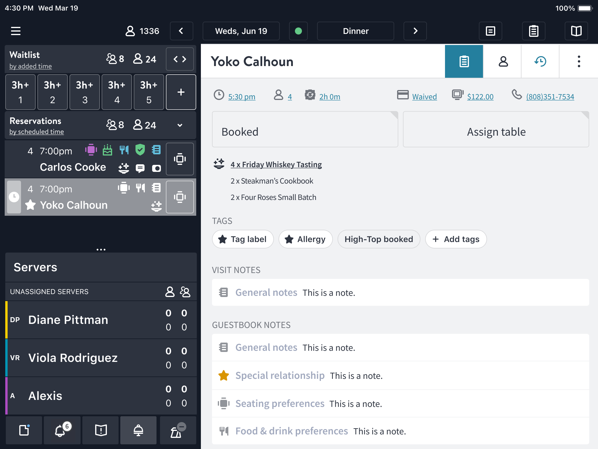
Three walls shaped every decision after that. Zero tolerance for data loss or regressions, because a missed allergy tag is a real guest at a real table. No retraining budget, because operators live here every shift under time pressure. Distributed ownership, because the flow spanned multiple engineering teams and had to be adoptable piecewise.
An architecture before a layout
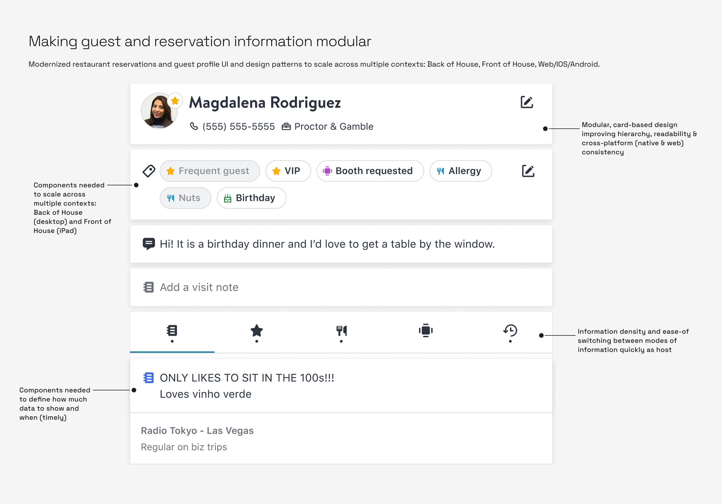
Rather than redesigning the page, we modelled it. The reservation card became zones for status, experiences, guest profile, visit notes and tags, and guest history. Each one could absorb new data without another redesign. What drove that bet was everything already queued: multiple guests, Venga and sentiment data, visit counts, takeout and delivery spend, POS spend per occasion, and third-party integrations.
We want to think of elements in the reso card as modular — utilized in other areas of OT.
Stakeholder feedback · FOH modernization review
Each zone then shipped as a repeatable pattern:
- Guest profile, identity first and readable in one glance
- Tags, structured and scannable service data
- Guest message, the guest's own words verbatim
- Notes tabs, five categories and one tap
- Notes as cards, guestbook with newest first
Options, weighed in the open
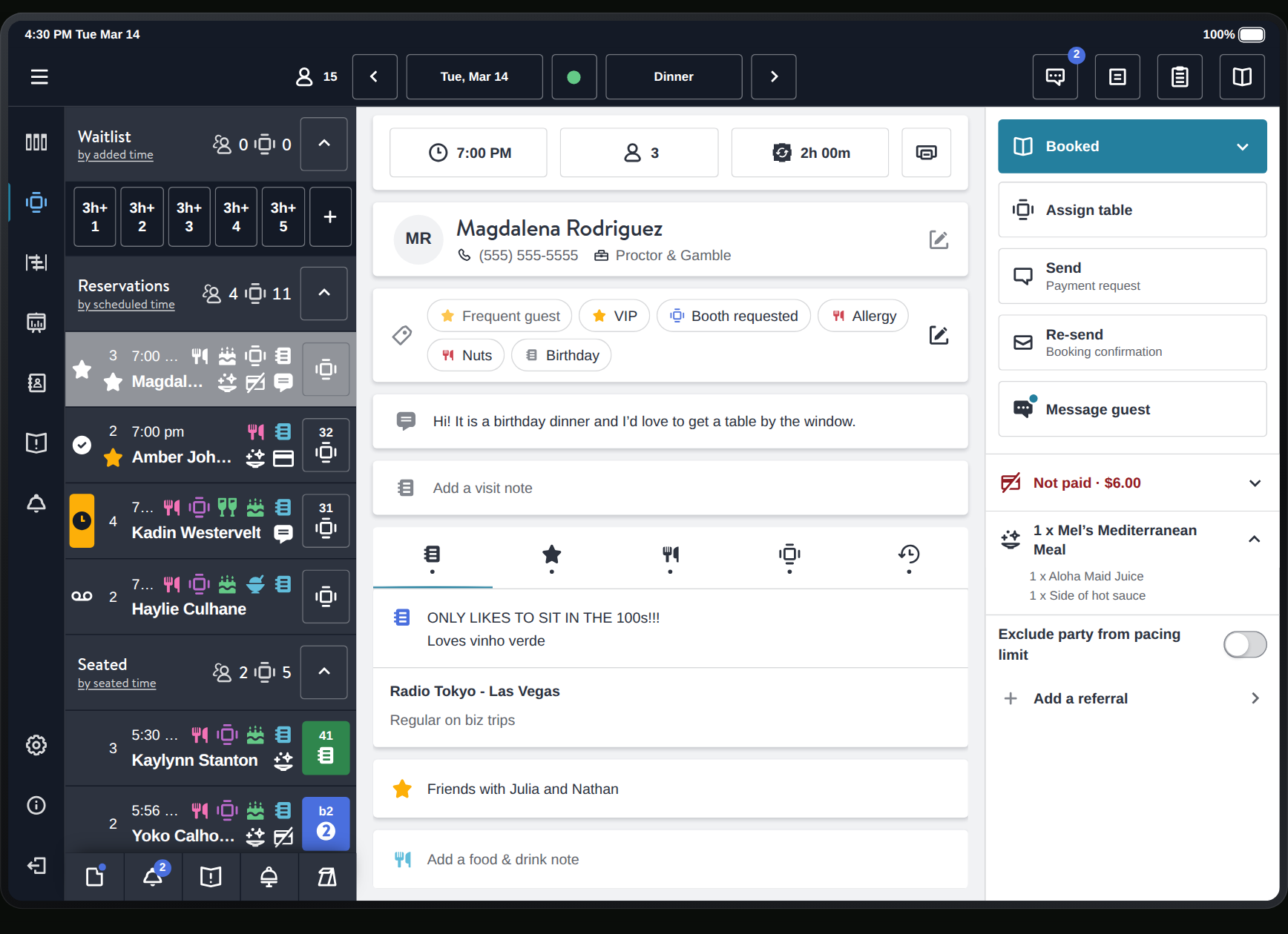
The actions were the contested decision. Where should Booked, Assign table and the rest actually live? Anchoring them to the foot of the card buried them below the fold as soon as notes ran long. Leading with them crowded the guest header that hosts scan first. In user testing the right rail won clearly. Users read it as *where actions live* without being prompted.
Two tradeoffs came with it. Status and Experiences moved into a rail the floorplan could reuse, which means related information now spans two panels; one reusable rail beat two bespoke ones. Notes moved off a long scroll into a segmented control, which puts content behind a tab; scanning beat scrolling.
Shipped, in hand
Mark Schroeder
General notes
Special relationship
Food & drink preferences
Seating preferences
History
- 3Visits3 Group
- 1Upcoming1 Group
- 0Cancellations0 Group
- 0No-shows0 Group
Fri, Oct 27 · Day of visit
Booked for Oct 27 at 6:45 am, party of 4
What it returned
The redesign earned its rollout one dinner rush at a time: a pilot with critical restaurant groups, feedback from real service, then a rollout with the risk contained. Zero regressions in critical workflows.
This [design] feels much more intuitive to use. Though at first the change felt a little confusing, once I got the hang of the tabs I was able to find the notes I needed much faster. I also appreciated the reservation status being easy to find outside of the reservation notes.
Host · large restaurant group, pilot
35 opt-in restaurant groups worldwide, a net gain by week 6. Host time on the card fell 18%, and time to the right note went from 11 seconds to 7. Asked whether *“the redesign made this faster,”* pilot operators agreed by workflow: 71% for seating, 68% for saving time overall, 64% for providing hospitality.
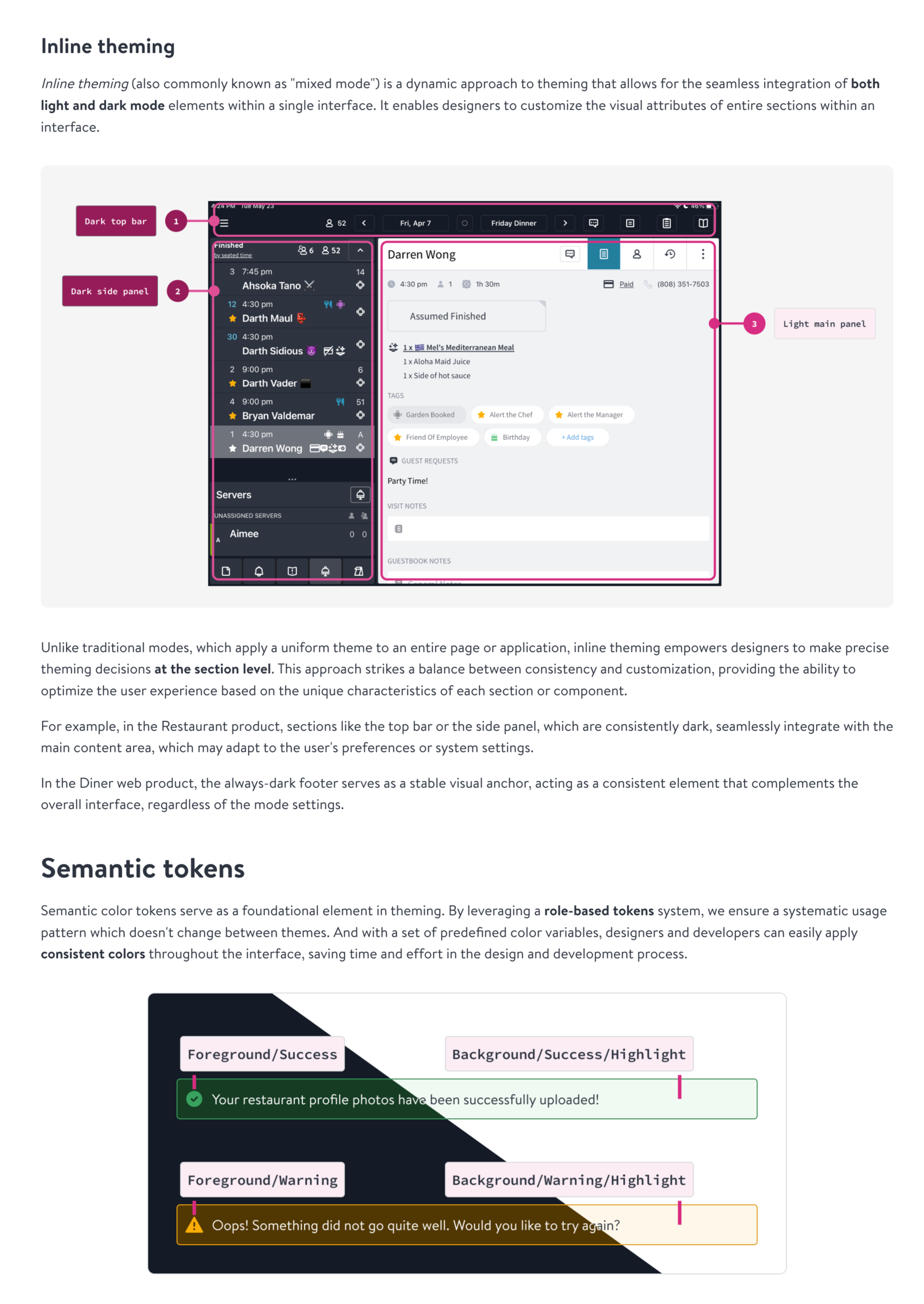
It was also OTKit's first test at real product scale: shared tokens and components across three platforms, fewer custom overrides, and a tighter loop between the system and the teams consuming it.
What I'd do differently
Categorize the IA by actionability from day one. Things you *act on*, like reservation and table status and experiences, belong in the rail. Things you *refer to*, like visit notes and tags, guest profile and visit history, belong in the card. That is the call that earned the rail, and it took longer to find than it should have.