Back to work
$ cat ./work/c1-decision-engine.md

Designing a Scalable Decision Engine for Enterprise Policy

Replaced spreadsheet-driven policy workflows with a modular, compliance-ready decision engine — enabling non-technical stakeholders to own complex rule logic without engineering support.

Design SystemsFintechCompliance
Company
Capital One
Year
2024 – 2025
Role
Principal UI/UX Designer, Design Systems
Timeline
5 months

Overview

Policy analysts at Capital One were building complex decision logic in spreadsheets — copy-pasting rules between tabs, manually cross-referencing compliance constraints, hoping nothing broke downstream. I led design systems strategy to replace that fragile workflow with a modular, system-aligned interface for high-stakes, compliance-sensitive environments.

Note: Details have been intentionally abstracted to respect confidentiality while preserving decision-making and impact.

Role
Design Systems Lead
Scope
System strategy, component architecture, governance
Team
2 designers, 2 PMs, engineering leads
Timeline
5 months

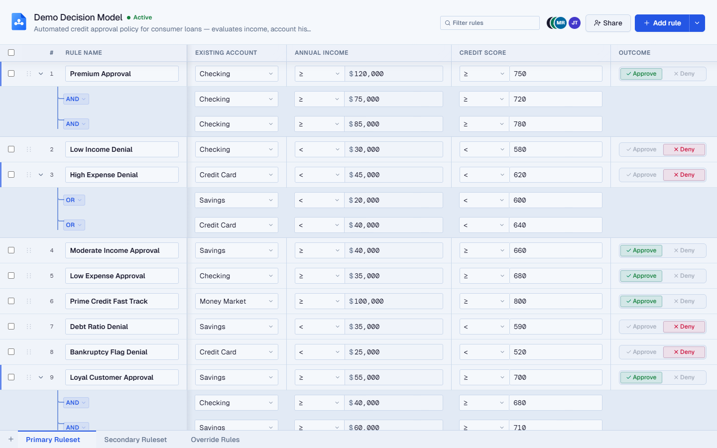
Coded prototype of the Decision Engine interface demonstrating interactive rule-building behaviour

Try the live prototype: full onboarding flow or skip straight to the table.

The Problem

Analysts relied on a patchwork of spreadsheets and inconsistent UI patterns to define and manage complex decision logic. The cost was real:

  • High cognitive load during rule creation
  • Increased risk of error in critical workflows
  • Inconsistent accessibility support
  • Slow onboarding and poor pattern reuse across teams

The core issue wasn't missing features. It was structural ambiguity.
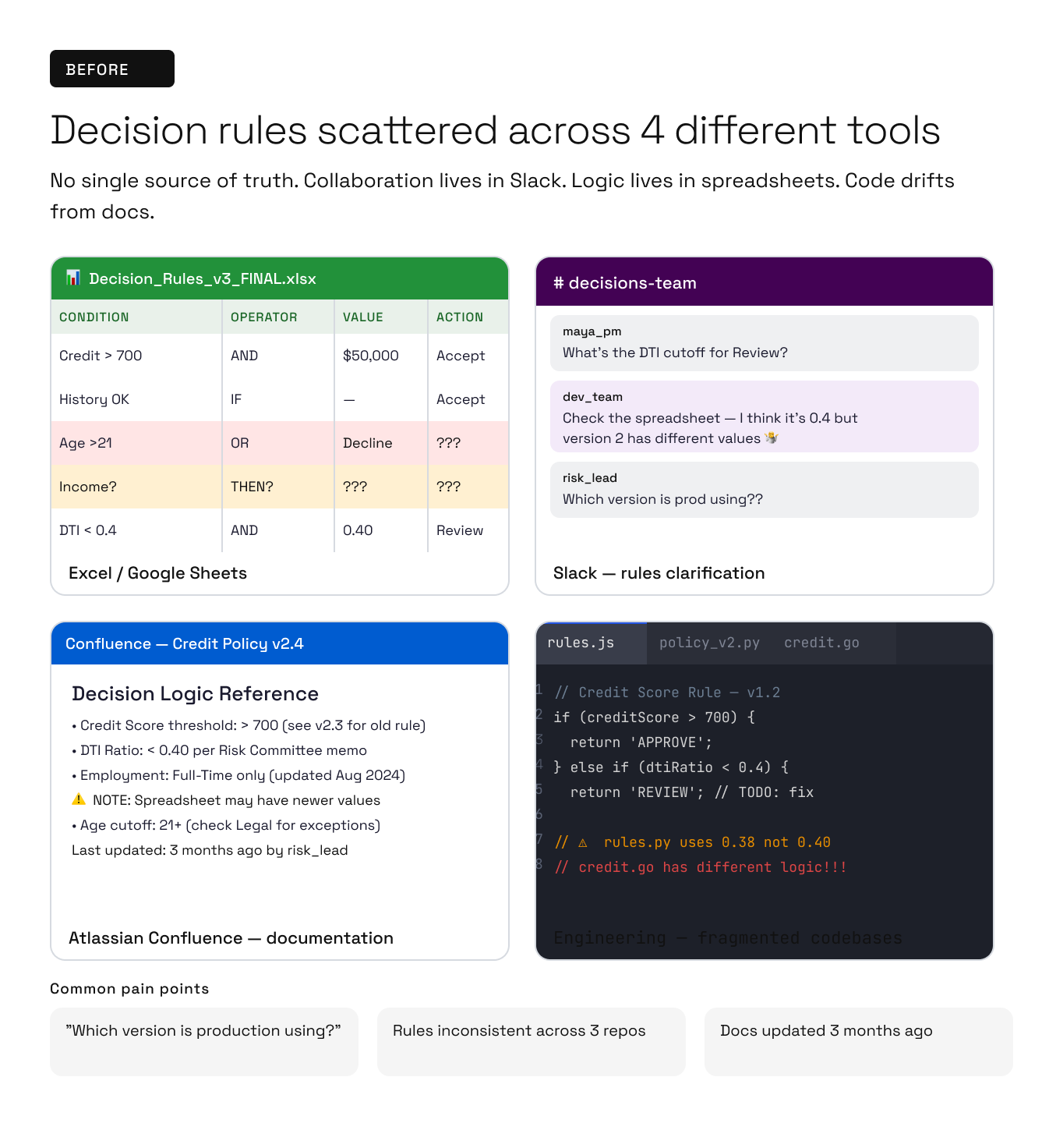
Before: spreadsheet workflow used prior to the decision engine

Constraints

  • Compliance-sensitive domain with low tolerance for error
  • Legacy interaction patterns deeply embedded in daily workflows
  • Code base was using open-source Ant Design System instead of Capital One's Gravity Design System
  • Need for incremental migration rather than a full rebuild

Strategy

Instead of redesigning screens, I focused on establishing a clear system hierarchy that could scale across use cases and teams.

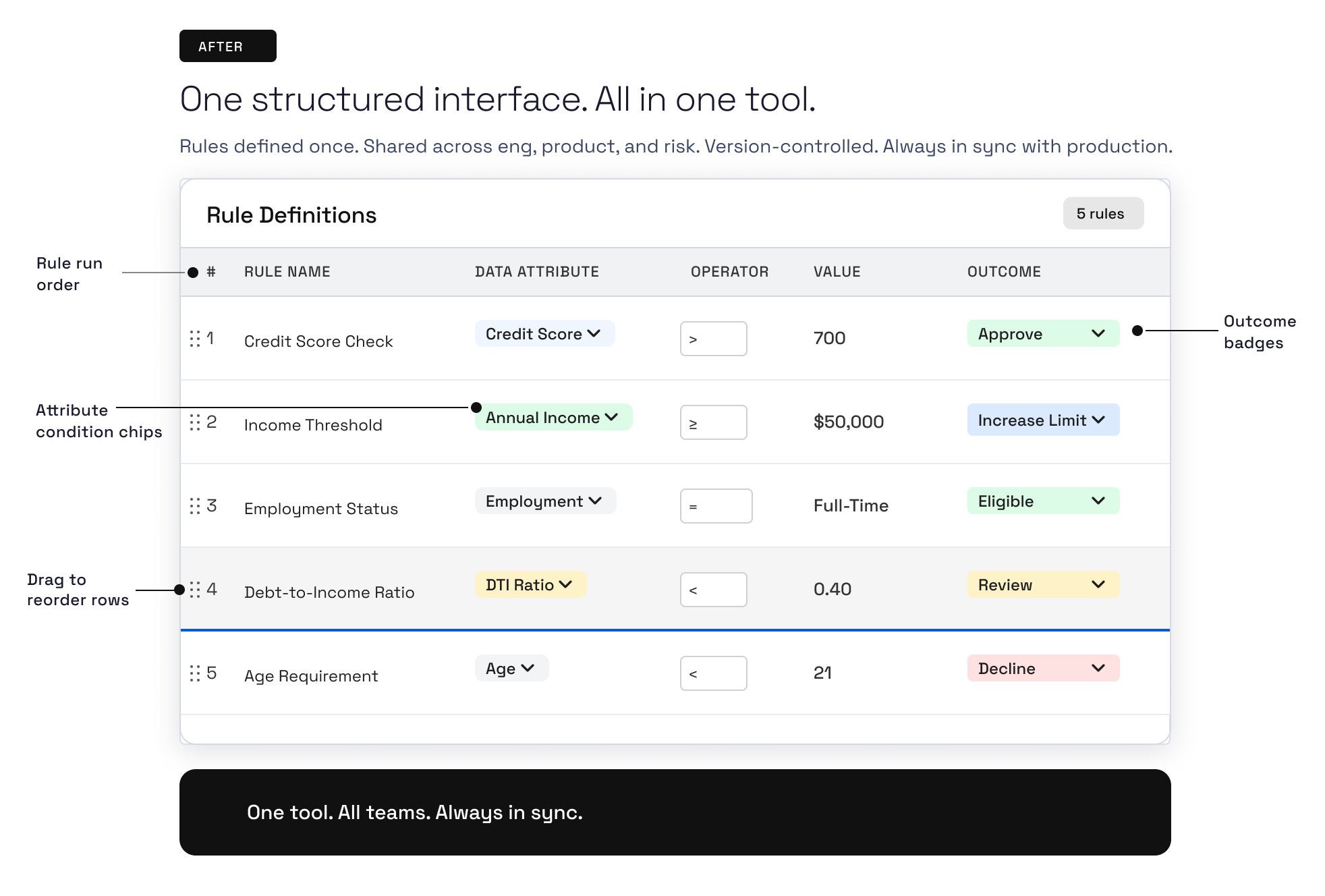
After: the decision engine table interface

The approach:

  • Define a progression from tokens → core components → reusable patterns
  • Encapsulate complexity rather than exposing it
  • Treat adoption and governance as design problems, not enforcement problems

Teams could reason about complex logic consistently — without sacrificing flexibility.


From Fragmentation to Modular Workflows

We replaced spreadsheet-style interfaces with modular workflows that made logic explicit and predictable.

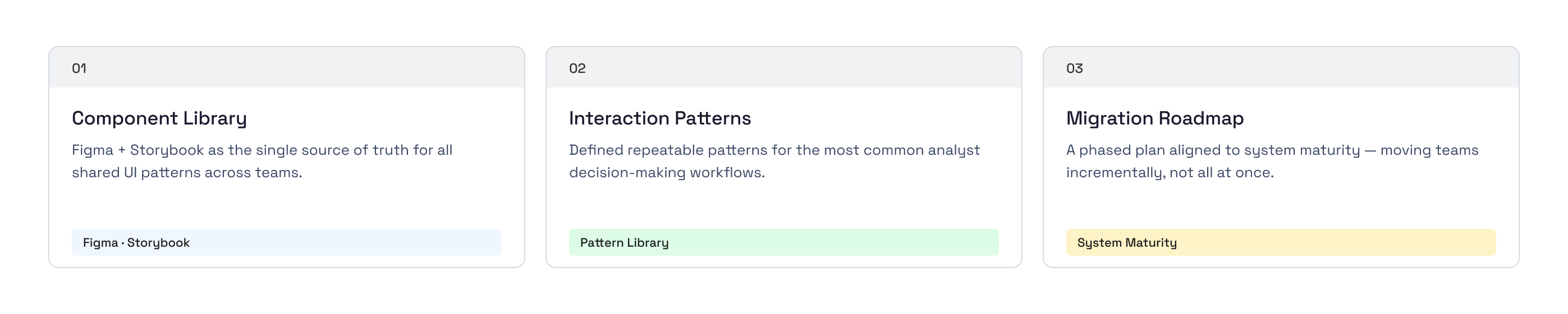
  • Centralized a shared component library (Figma and Storybook) as the single source of truth
  • Defined repeatable interaction patterns for common analyst tasks
  • Created a migration roadmap aligned to system maturity

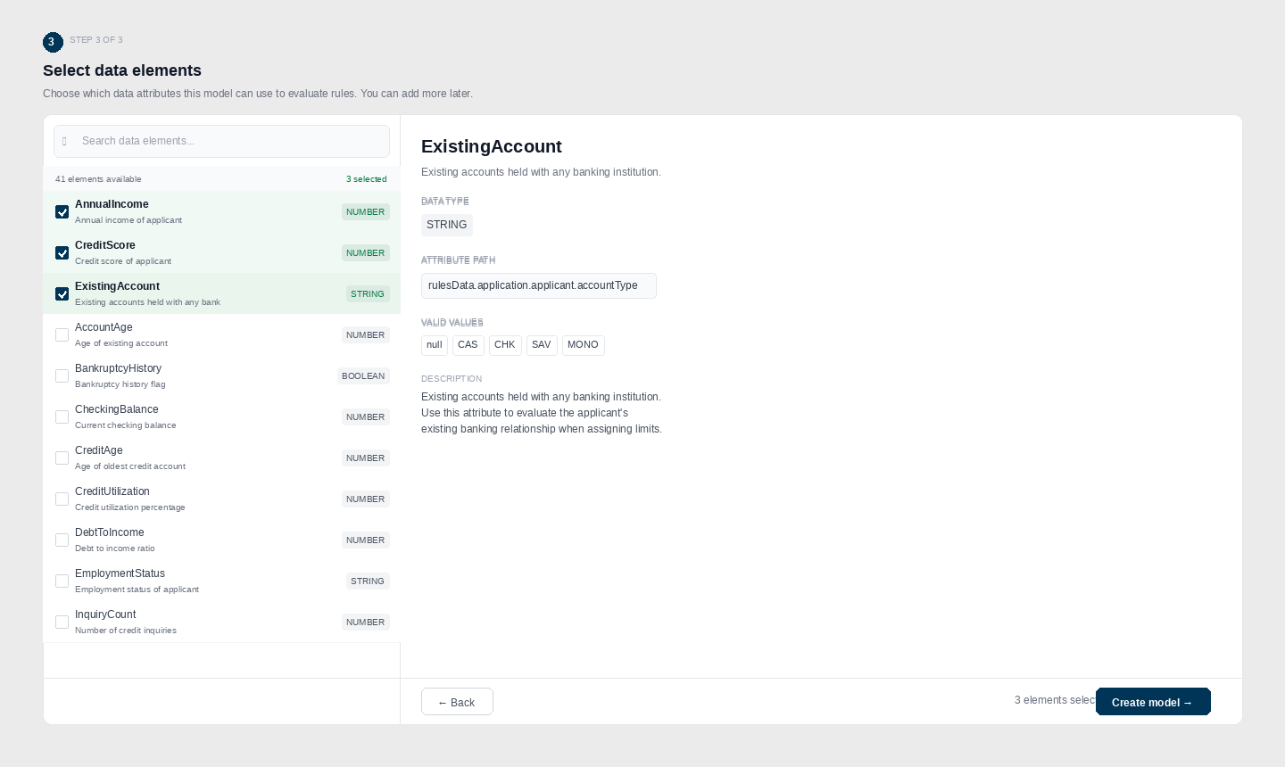
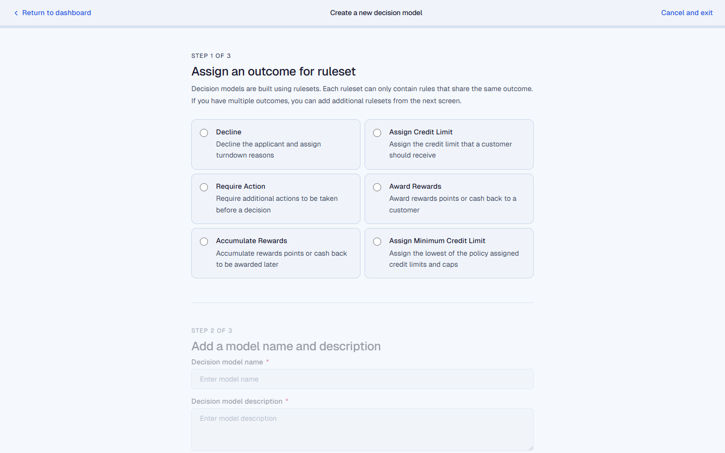
The onboarding flow walked analysts through a three-step setup on a single page: choosing an outcome type, naming the model, and selecting the data elements it could evaluate. Each step was scoped to a single decision, reducing cognitive load before reaching the main interface.

Design deliverables for the C1 Decision Engine: component library, interaction patterns, and migration roadmap

Design goals

  • Surface upstream dependencies and validation states
  • Reduce interaction cost for defining logic
  • Support both novice and expert analyst behaviors

Each rule row maps a data attribute to an operator, a threshold value, and a decision outcome. The inline edit model (badge tap to swap attribute, dropdown for operator, direct input for value) eliminated the modal-heavy workflows analysts had been tolerating, cutting the path to a saved rule from eight clicks down to three (a 63% reduction).

Impact

In discovery testing, analysts completed 12 of 13 tasks against the new model, with markedly lower error rates during rule creation than the spreadsheet baseline.


Live Prototype

A public-safe, runnable version of the prototype is live: try the full onboarding flow or skip straight to the table. It's an open-source extraction of the rule-row pattern, rebuilt in React, TypeScript, and Vite. It strips out the proprietary domain logic, keeps the interaction model intact, and ships the result as a reference implementation for the same class of decisioning interface.

Onboarding: three decisions, one page

Rather than dropping users into an empty editor, the prototype opens with a guided three-step setup: pick an outcome type, name the model, then choose the data the model is allowed to evaluate. Each step is scoped to a single decision, and the whole flow lives on a single scrollable page so the model's shape stays visible while you build it.

Step 1 of the onboarding flow: Assign an outcome for ruleset, with six options (Decline, Assign Credit Limit, Require Action, Award Rewards, Accumulate Rewards, Assign Minimum Credit Limit)
Step 1: outcome picker. Six mutually exclusive outcomes, each with a one-line description.
Step 3 of the onboarding flow: Create your first rule, showing a categorized data-element picker (FINANCIAL, EMPLOYMENT) with checkboxes and a type badge for each element
Step 3: categorized data elements. The right pane previews details for the selected element before you commit to it.

The rule table

Once setup is done, the model opens into the main editor: a five-row example ruleset showing each rule as a single line with name, data attribute, operator, value, optional companion attributes, and the outcome.

Main rule table: five rules with colored data attribute badges (Income green, Expense red), operator dropdowns (At least, Less than, Greater than, At most), amount values, and segmented Approve/Deny outcome switches per row
Five rules, each editable inline. Colored badges for data attributes; dropdowns for operators; per-row segmented outcome.

Segmented Approve / Deny outcome

Each row's outcome is a segmented two-state control: green Approve on the left, red Deny on the right, with the unselected side rendered as a muted ghost. It's faster than a dropdown for binary outcomes and reads at a glance when scanning a ruleset.

Close-up of the Outcome column showing per-row segmented switches alternating between Approve (green) and Deny (red) selected states
The segmented switch makes a binary outcome scannable. Selected state carries the color; the other side recedes.

Split-button progressive disclosure

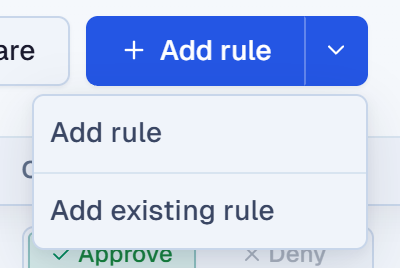
The primary CTA is a split button: the main face is + Add rule (the common path), and a chevron beside it opens a small menu with the secondary action, Add existing rule. The split keeps the default action one click away while making the alternative discoverable rather than buried in a kebab menu.

Split-button dropdown opened from the chevron next to + Add rule, showing two options: Add rule and Add existing rule
Split-button. One-click default, one-click-and-pick for the secondary action.

Accessibility as a System Lever

Accessibility improvements were embedded at the system level rather than treated as retrofits.

The results:

  • ~30% improvement in accessibility compliance
  • Clearer focus states and keyboard navigation
  • More predictable interaction behavior across components

Accessibility became a forcing function for better structure and clarity.


Outcomes & Impact

  • Unified interaction patterns across a critical enterprise workflow
  • Faster analyst task completion in usability testing
  • Reduced design and QA overhead through shared tokens and components
  • Established a scalable foundation for future platform growth

Next Iterations

  • Expand the component library to support new data interaction models
  • Refine token architecture for faster theming and dark mode support
  • Deepen async contribution rituals to scale governance sustainably

Reflection

In complex enterprise systems, clarity is a performance feature. This work reinforced that scalable UX isn't about simplifying problems. It's about making complexity legible.