Overview
I led the redesign of OpenTable’s restaurant reservation details flow—a business-critical interface used daily by restaurant operators. The work modernized a dense, legacy experience while preserving information richness, improving usability, and aligning the product with the evolving OTKit design system.
This project demonstrates how design systems can drive practical product outcomes, not just visual consistency.
 Reservation details redesign - before and after
My role: Design Systems Lead, Product Partner
Scope: UX strategy, system alignment, component modeling
Team: 3 designers, 6 engineers, 2 PMs
Timeline: 10 weeks
The Problem
Reservation details had become a dumping ground for years of accumulated features.
The experience was:
- Dense and visually fragmented
- Difficult to scan under time pressure
- Inconsistent across platforms
- Costly to maintain due to distributed ownership across engineering teams
Despite its importance, it had the most legacy styling in the product—making UX improvements slow and risky.
 Legacy reservation details view. High density, low hierarchy, fragmented styling.
Constraints
- Zero tolerance for data loss or behavioral regressions
- Heavy daily usage by restaurant staff
- Multiple engineering teams owning different parts of the flow
- Need to preserve information density while improving clarity
Strategy
Rather than redesigning the page wholesale, we treated the reservation view as a modular system problem.
Key principles:
- Preserve density, improve hierarchy
- Replace bespoke layouts with reusable system components
- Design once, scale across platforms
This allowed us to modernize the experience without disrupting established workflows.
 Each section of the reservation view mapped to a discrete system pattern, making the layout predictable for both users and engineers.
Solution: Modular, Card-Based Architecture
We restructured the reservation details view into a modular, card-based layout that:
- Clarified information hierarchy
- Improved scannability under time pressure
- Enabled consistent behavior across mobile, tablet, and desktop
- Reduced one-off UI logic in engineering
Each card mapped to a system pattern, allowing teams to iterate safely and predictably.
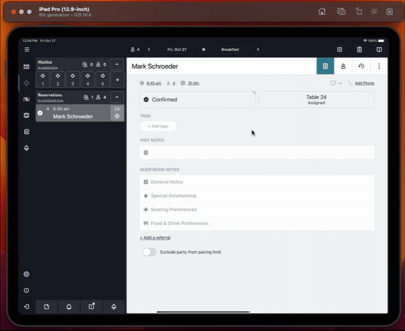
 The new Reservation and Guest Profile in Front of House Mobile iOS
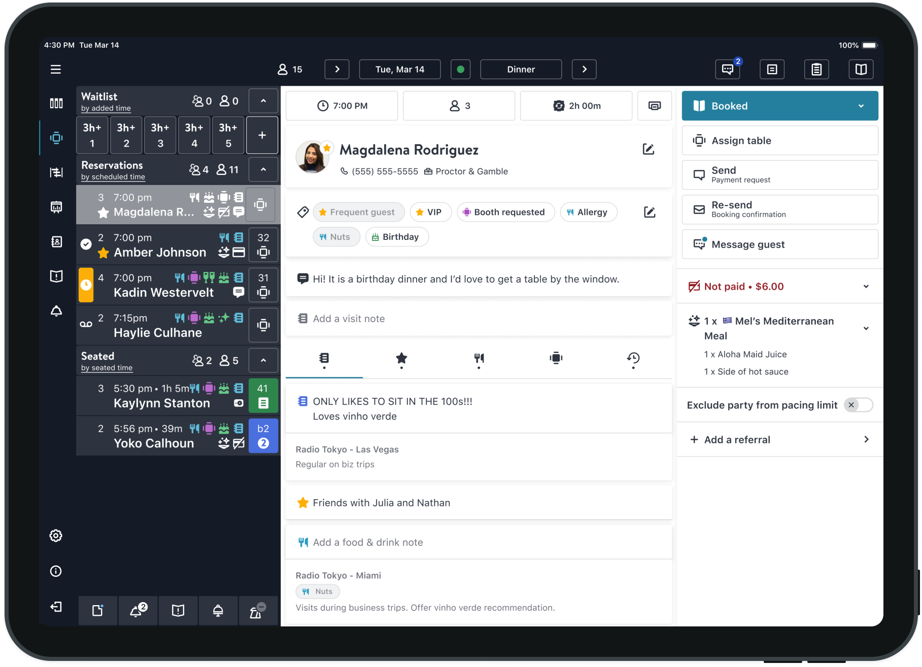
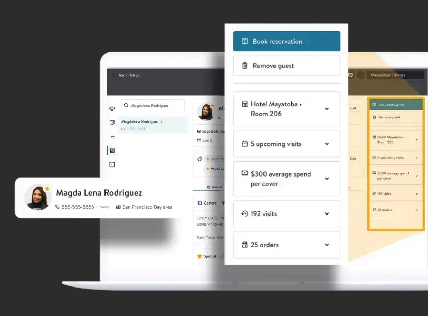
 The modular card architecture in action — each zone behaves predictably and scales responsively across screen sizes.
Modular ecosystem
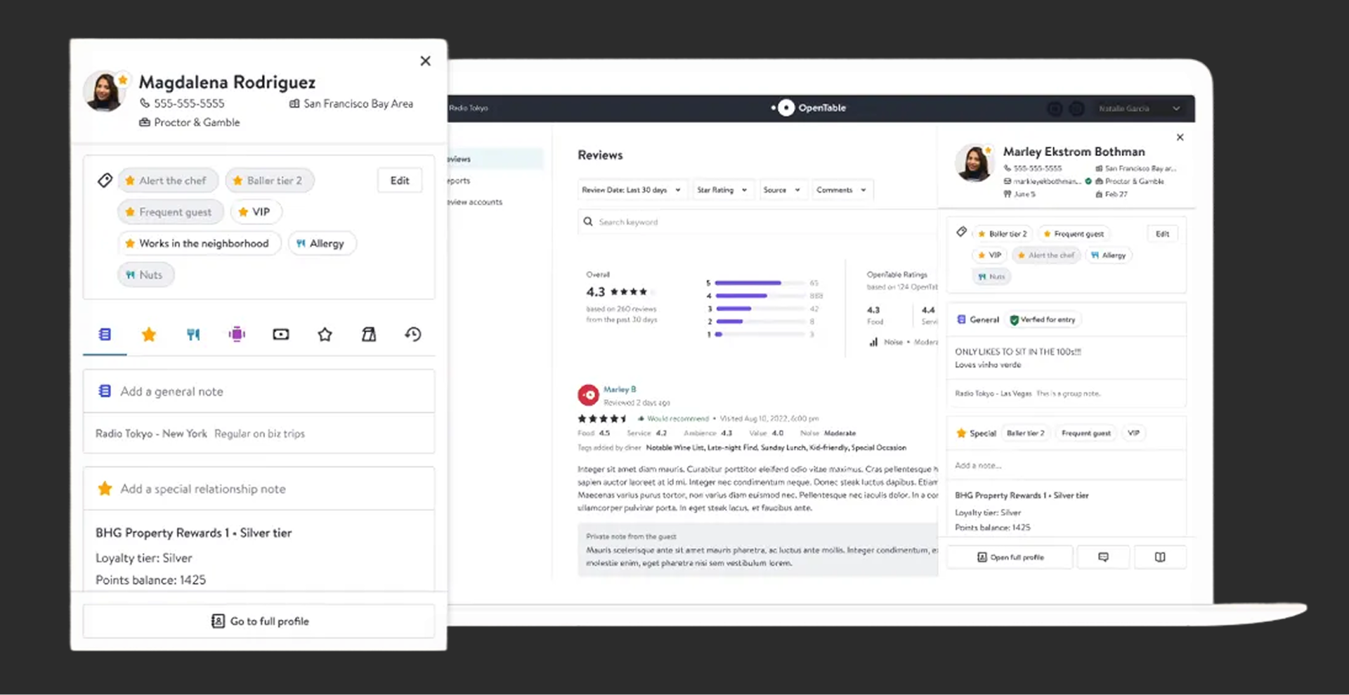
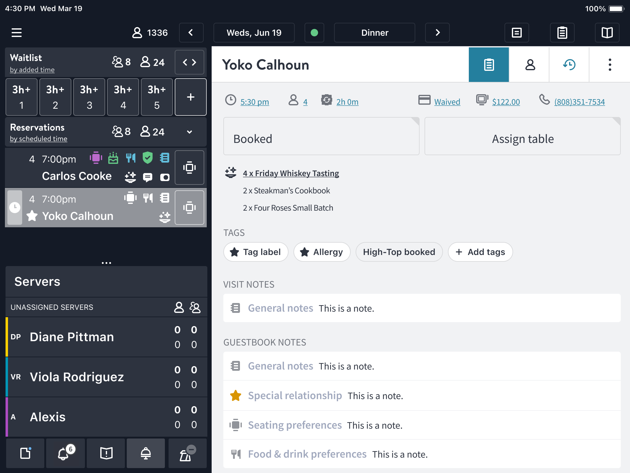
 The new Guest Profile component made guest data easily viewable in Back of House
System Alignment
This work became a proving ground for OTKit in real product conditions.
We:
- Applied shared tokens and components across platforms
- Validated cross-platform typography and spacing decisions
- Reduced reliance on custom overrides
- Tightened the feedback loop between system and product teams
The result was faster iteration with fewer regressions.
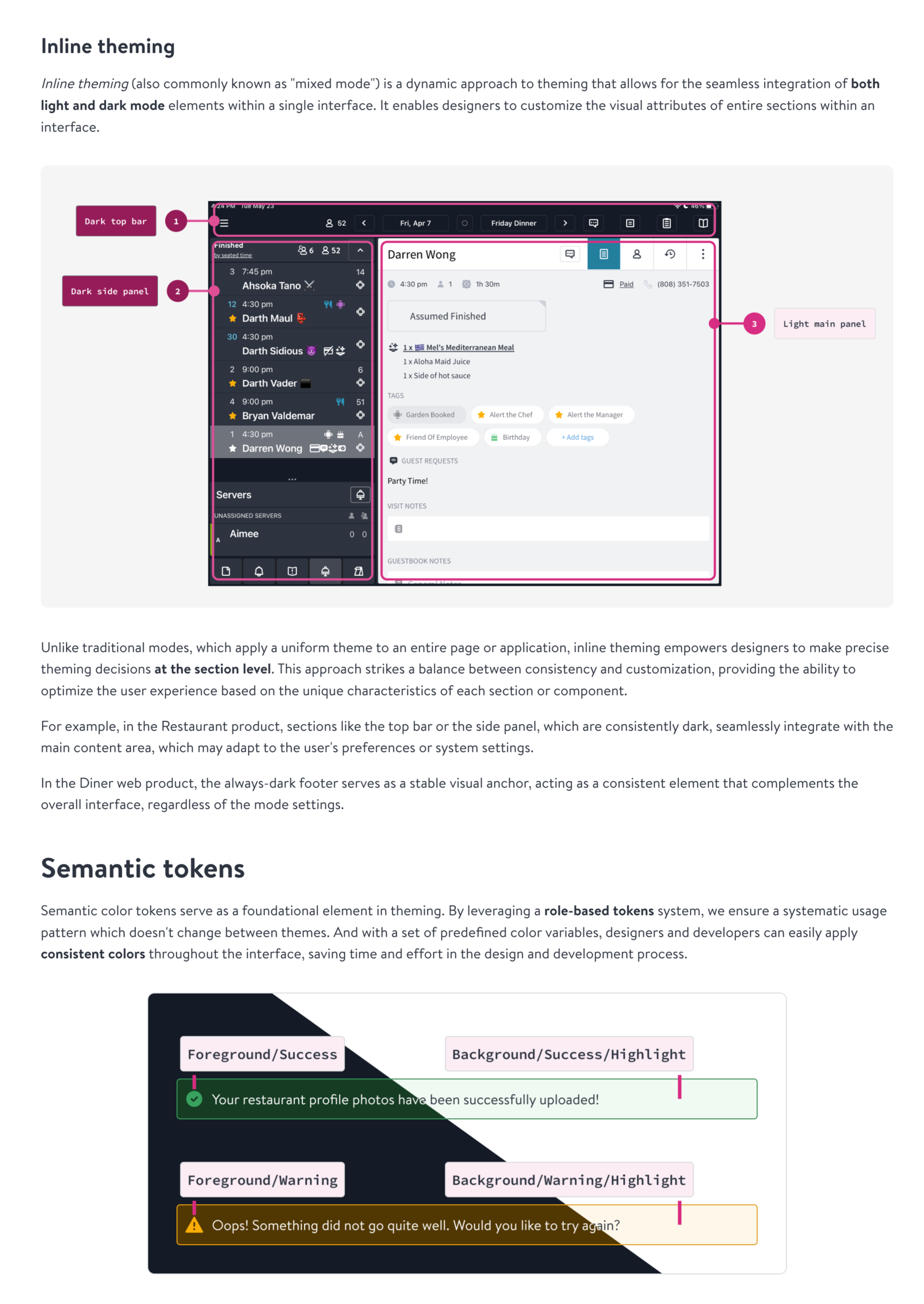 Support for inline theming was implemented to support mixed legacy theming before full light/dark theme were prioritized
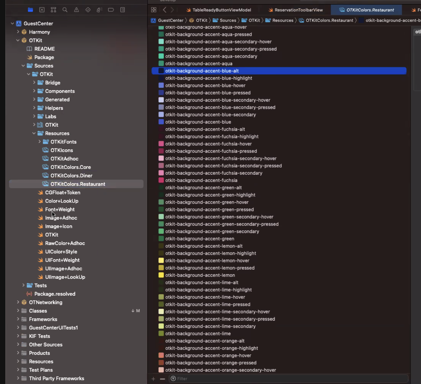 OTKit color tokens
Outcomes & Impact
- Modernized a core operational workflow without sacrificing density
- Improved readability and hierarchy in a high-stakes, time-sensitive interface
- Reduced QA friction by replacing bespoke UI with shared system patterns
- Strengthened trust in OTKit through visible, high-traffic product adoption
Reflection
Designing for restaurant operators reinforced that usability isn’t about simplification—it’s about clarity under pressure.
This work showed how design systems can enable meaningful product improvements without disrupting workflows that teams depend on daily.