 Diner and Restaurant OpenTable product apps on iPad and iPhone
Overview
OTKit is OpenTable’s design system supporting Restaurant and Diner products across iOS, Android, and web. When I took ownership, the system existed—but lacked cohesion, governance, and trust. Design drift, fragmented sources of truth, and inconsistent adoption were slowing teams down and introducing costly QA issues.
My mandate was not just to redesign components.
It was to turn a drifting system into an operational platform teams actually relied on.
My role: Design Systems Lead
Scope: iOS, Android, Web
Team: 6 product teams
The Problem
Design system drift was expensive and invisible.
Research through user surveys and 1:1 interviews revealed:
- Three competing sources of truth (Figma, Storybook, internal token sites)
- Visual inconsistencies across products and platforms
- Late-stage QA bugs tied directly to token and component mismatch
 Design system drift across OpenTable products before consolidation.
We estimated the cost of drift at ~$237K/year in inefficiency and rework.
Constraints
The system had to evolve without stopping product delivery.
- Six product and platform teams shipping in parallel
- Legacy UI patterns deeply embedded in production
- Cross-platform requirements (iOS, Android, Web)
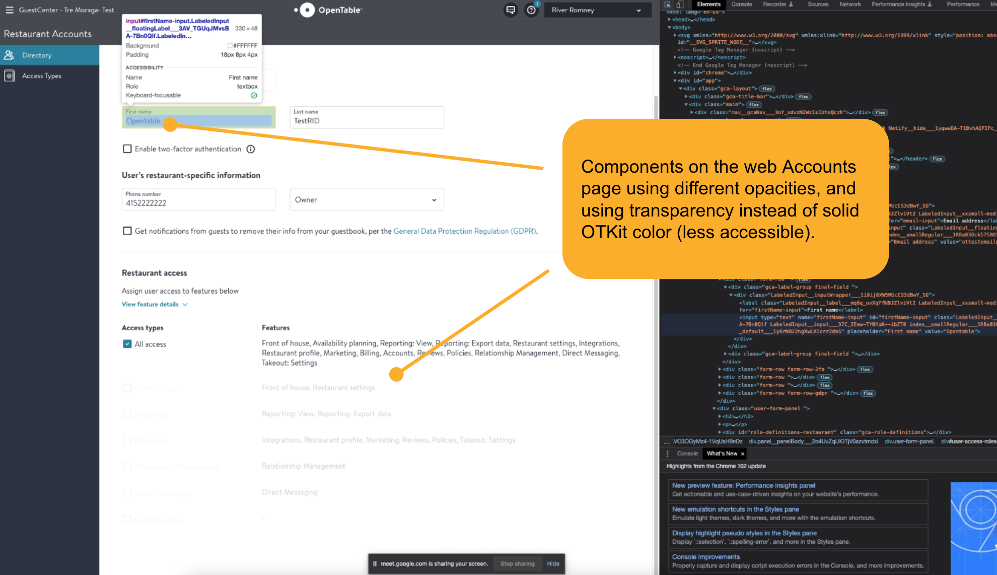 Inconsistent and inaccessible components on web.
Strategy
To stop drift without breaking teams, I focused on foundations first, then scaled upward:
- Tokens before components
- Accessible color and typography foundations
- Documentation as a first-class system artifact
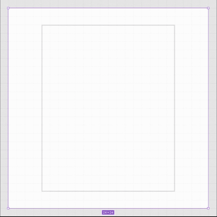
Foundations: Tokens, Type, Icons
These foundational changes unlocked consistency without forcing large rewrites, making adoption possible across active codebases.
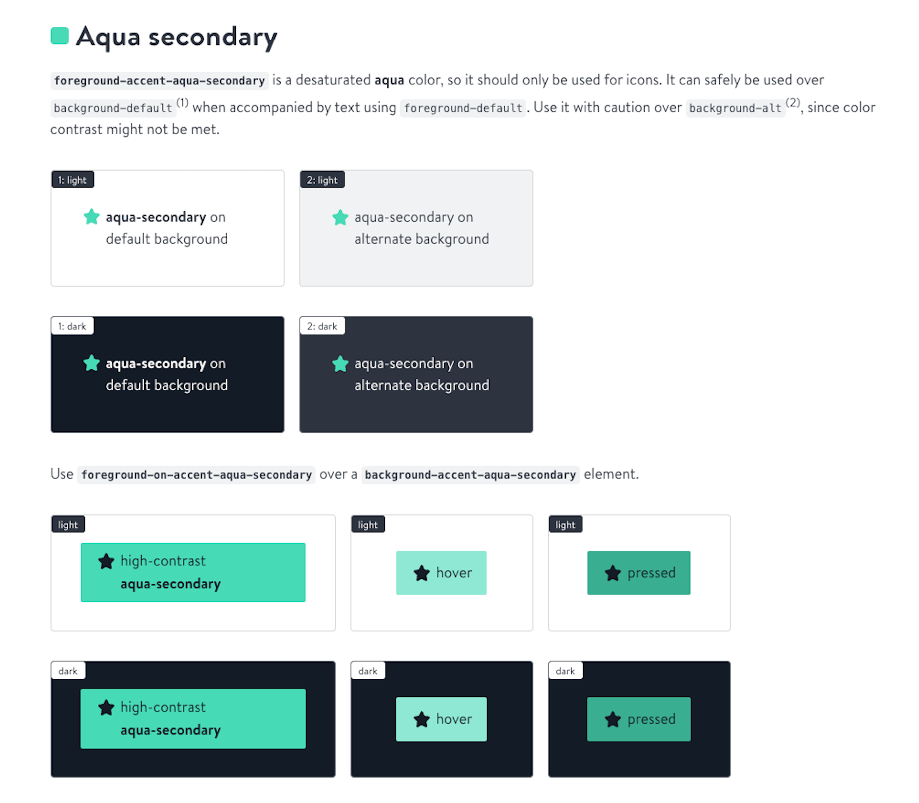
Color tokens
- Audited and documented all existing colors cross-platform
- Deprecated legacy redundant colors
- Rebuilt the color system around accessible, semantic tokens
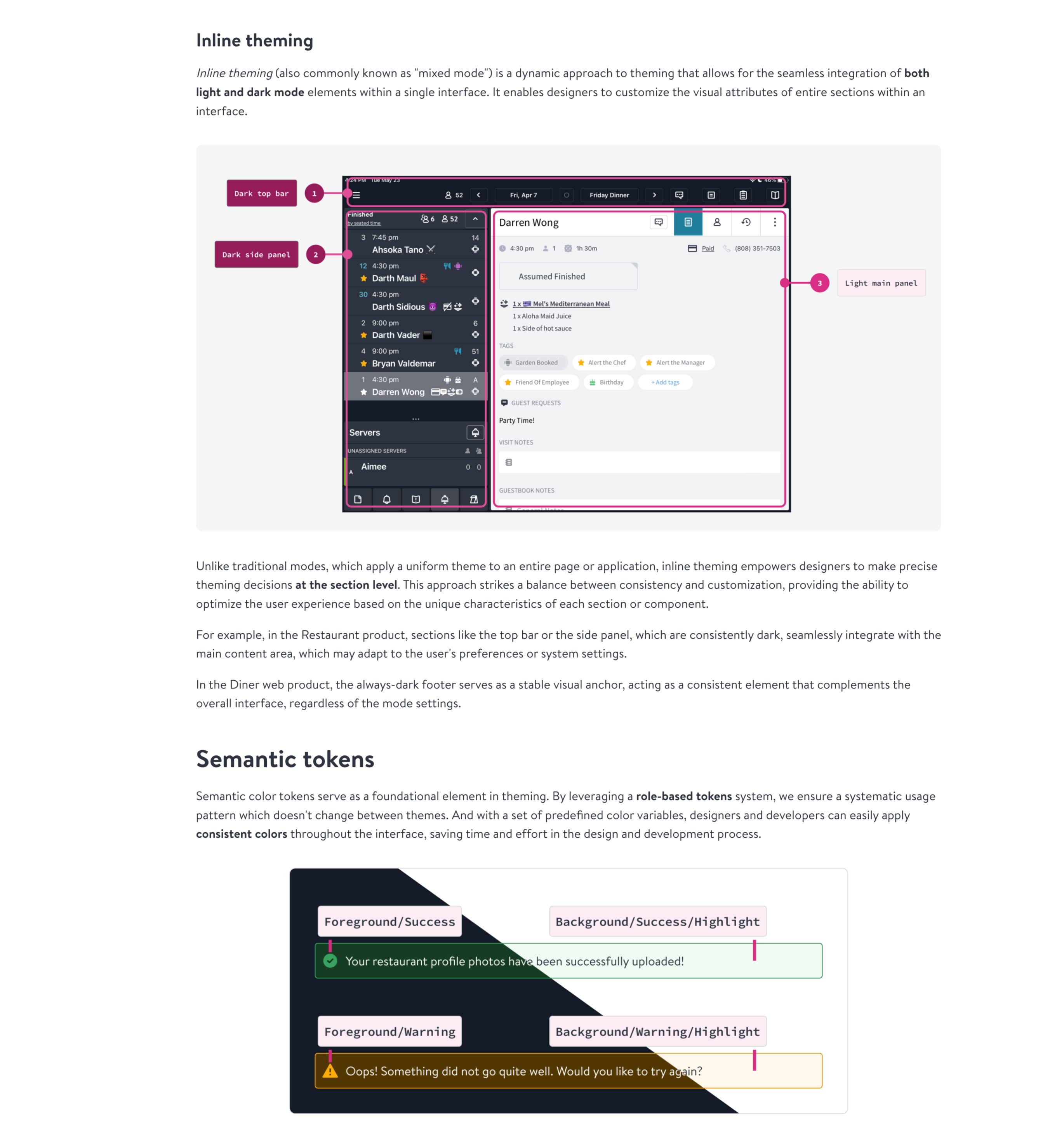
- Built “mixed” light/dark theming for existing UI
This resolved cases where critical actions appeared disabled, improved cross-platform parity, and allowed teams to adopt the system without rewriting existing UI.
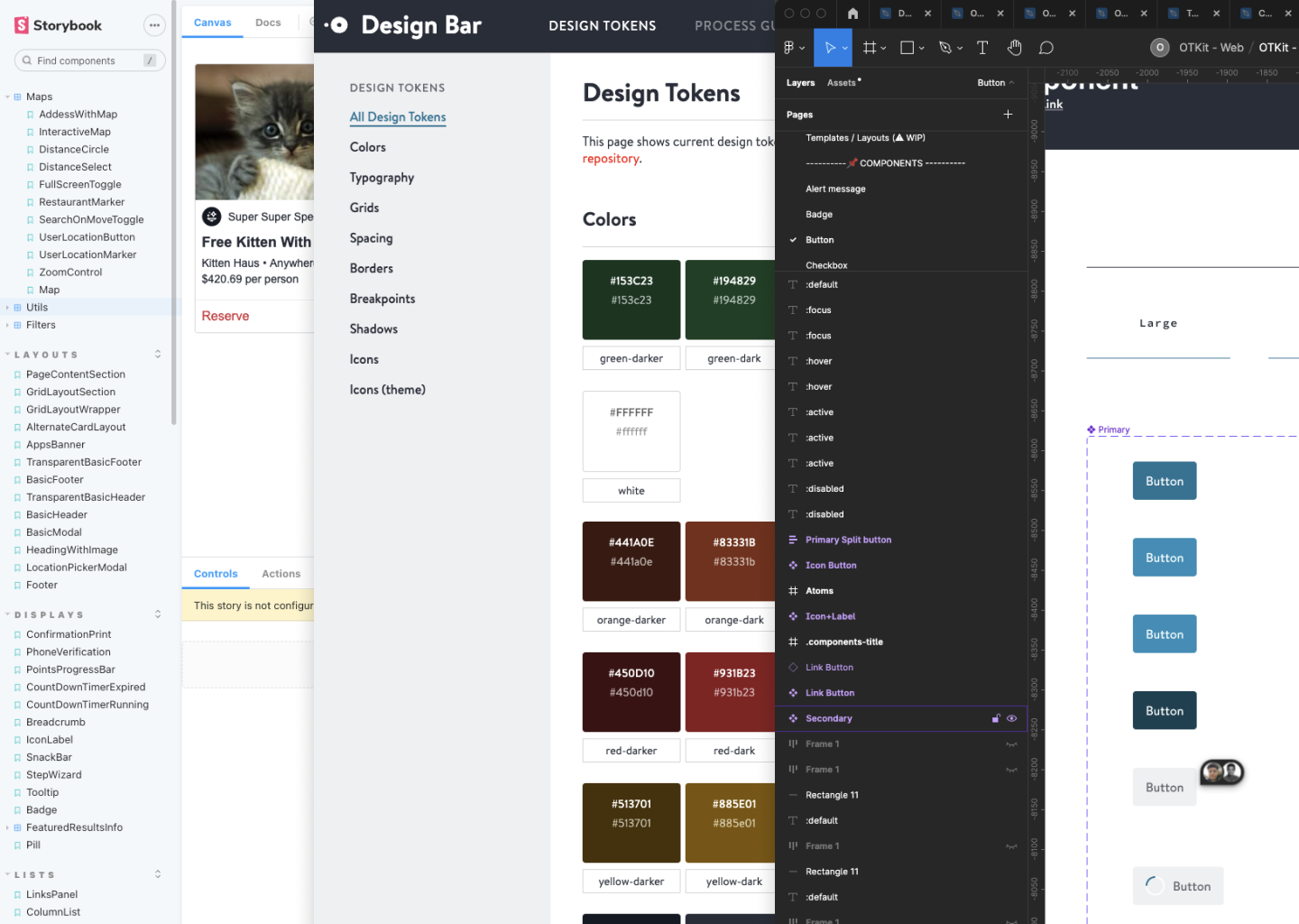
 Semantic vs primitive token breakdown, and color token mapping slide.
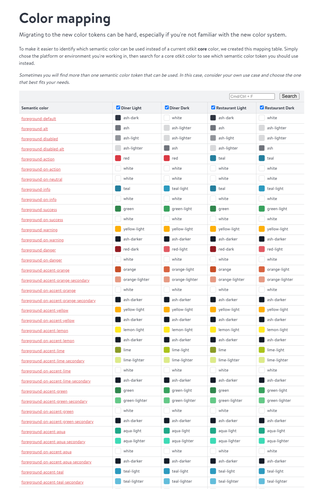 Establishing semantic tokens created a single source of truth across platforms and reduced downstream inconsistencies.
Contextual typography
The existing type system was a one-size-fits-all scale that:
- Was not mobile-optimized
- Encouraged incorrect font usage in native apps
- Had ballooned to 39 fonts in the codebase
 Diagram illustrating how contextual typography scales across platforms
Solution
- Introduced a contextual typography scale by platform
- Defined size, weight, and family per context
- Added support for Apple Dynamic Type
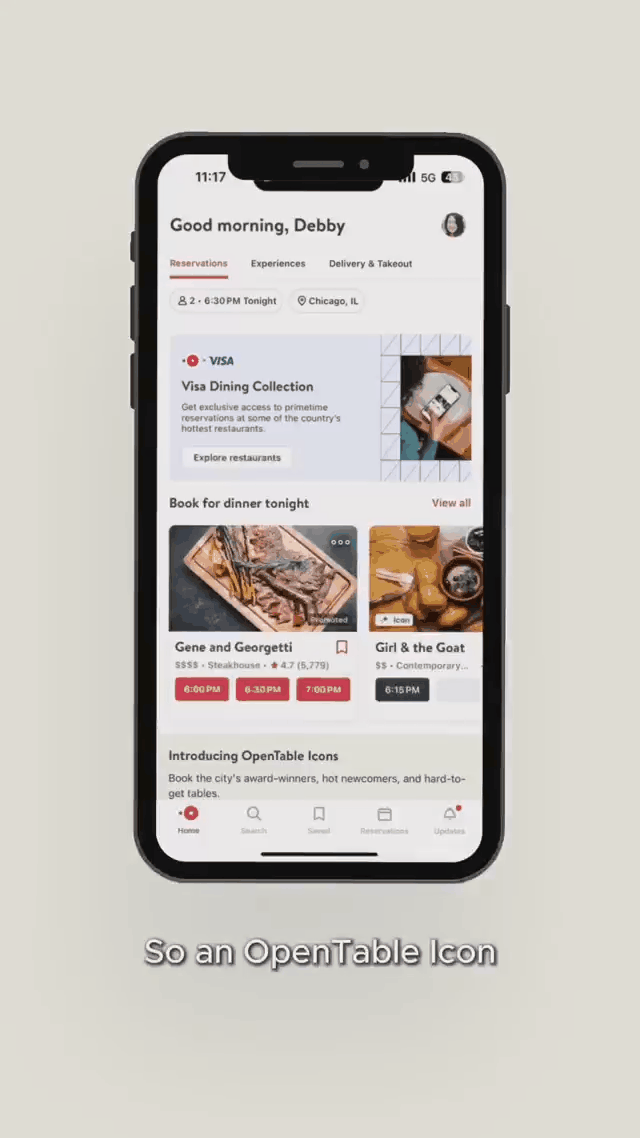
Impact A/B testing showed a +2.19% increase in diner bookings on pages using dynamic type.
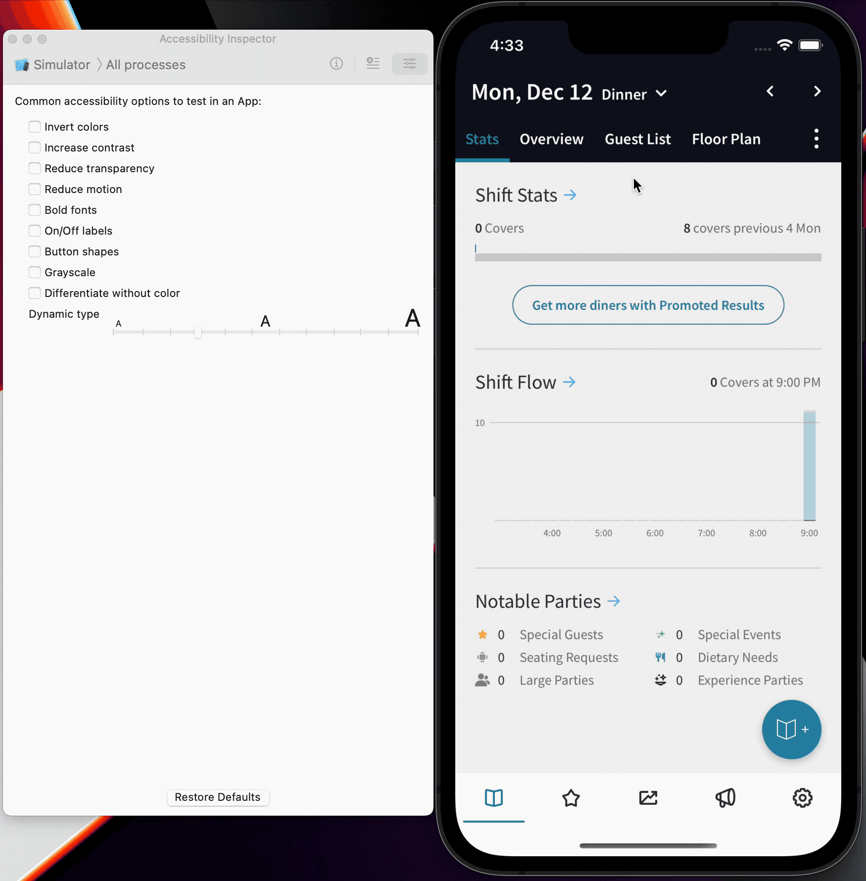 Animation of dynamic text sizing implemented on iOS
 The contextual type scale reduced 39 font variants to a purposeful, platform-aware system.
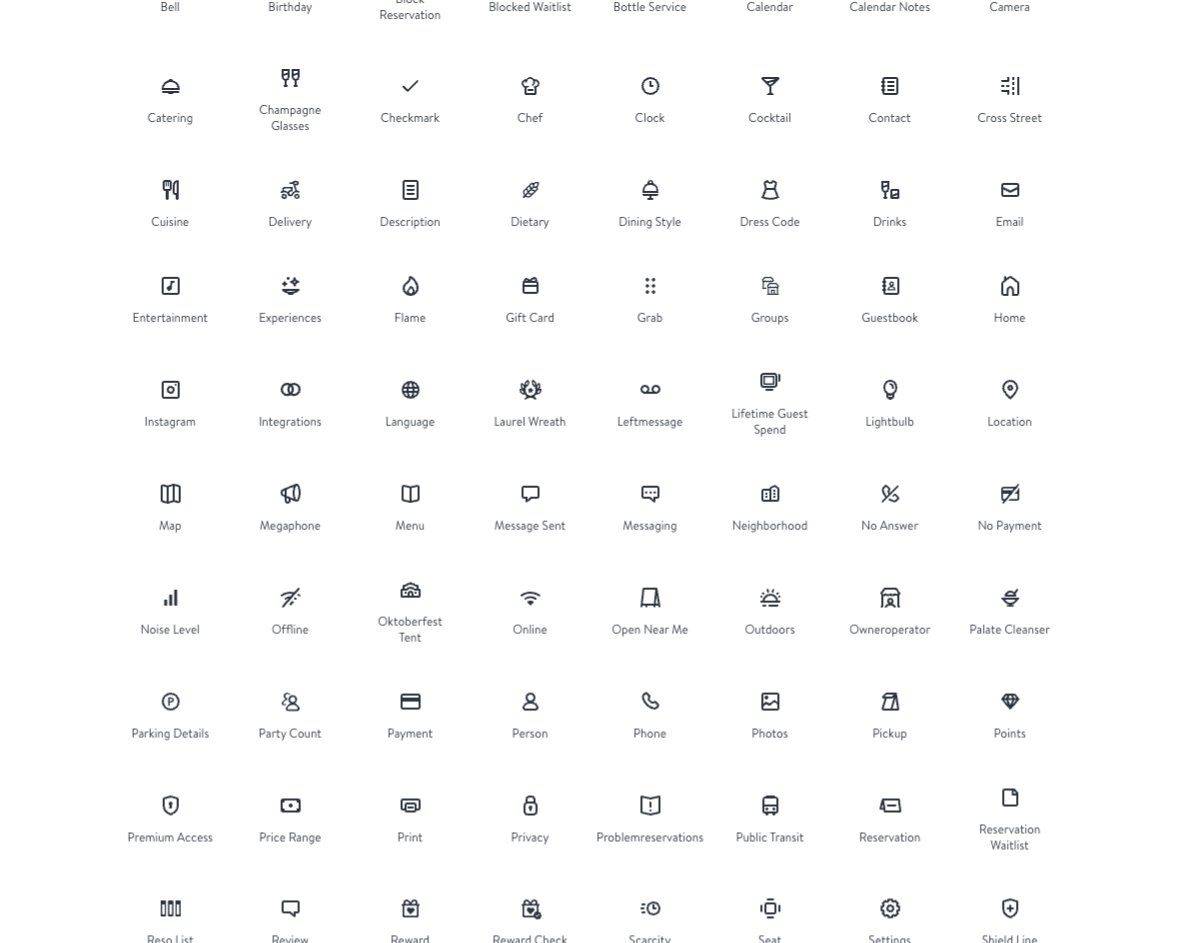
Icon system
- Introduced shape-based icon grids
- Unified keyshapes for indicators
- Centralized icon repositories across platforms
- Added SF Symbol parity for accessibility
This enabled a searchable, themeable SVG system shared across native and web teams, reducing duplication and improving accessibility parity.
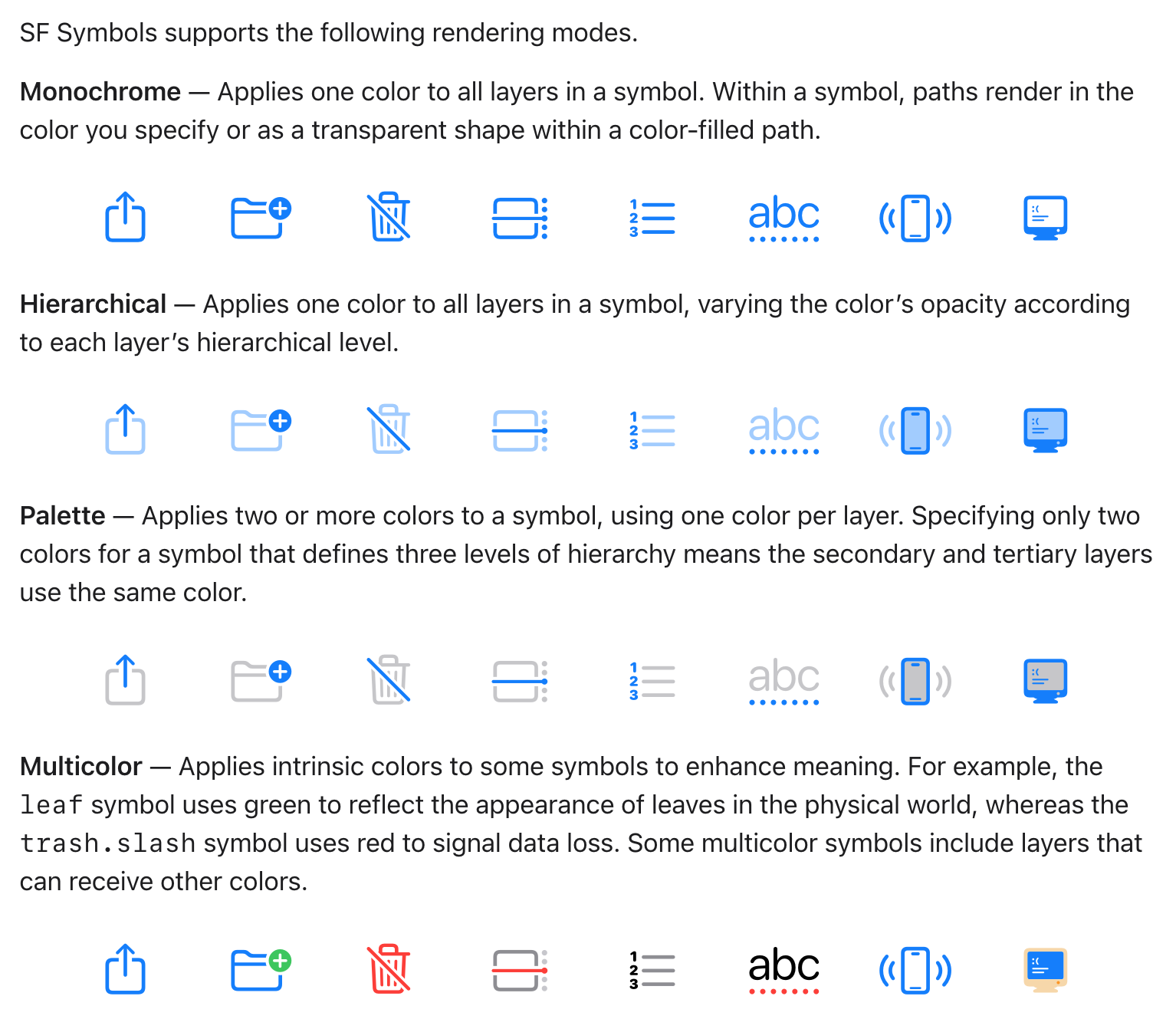 SF Symbol parity ensured accessibility-compliant icon behavior on iOS without duplicating icon work.
Brand Evolution: “Black Is the New Red”
OpenTable operates in an industry dominated by red and orange. Partnering closely with Brand, we translated a premium direction into a tokenized theming architecture rather than one-off visual treatments.

This allowed brand evolution without breaking product consistency. Namely:
- Two new font families
- A refreshed color palette
- Visual distinction for Iconic restaurants
The key insight: by encoding brand decisions as token values rather than hardcoded styles, the system could absorb a major brand shift without requiring teams to rewrite their components.
Theming in Practice
The tokenized architecture made it possible to deliver two visually distinct experiences from a single component library.
Mass Theme
The Mass theme serves OpenTable’s core restaurant audience. Editorial in feel, it uses a two-column structure inspired by e-commerce—booking surfaced immediately, decisions guided with minimal visual noise. Every component follows the same token-driven pattern, so new features land consistently without bespoke design decisions at the component level.
Iconic Theme
For OpenTable’s premium Iconic restaurant tier, the system delivered a distinct but coherent experience. Full-bleed photography, dark wine-inspired time slot styling, and sticky booking flows communicated prestige without sacrificing usability. The same underlying tokens and components powered both themes—no fork required, just a different set of token values.
Outcomes & Impact
Over the course of the engagement, OTKit delivered measurable ROI:
- 25% reduction in QA time
- ≈ $59K/year reclaimed in developer time
- 50% fewer Figma libraries
- Unified design language across 6 teams
- Supported a full OpenTable brand refresh
 OTKit scaled across 6 product teams, supporting iOS, Android, and web simultaneously.
What Made This Work
OTKit’s adoption didn’t happen through enforcement. We built a network of design ambassadors—designers embedded in product teams who championed the system locally and surfaced friction back to the core team. This created a feedback loop that made the system more useful over time.
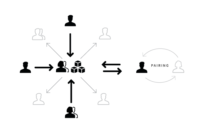 Design ambassadors in product teams acted as system advocates and real-world feedback channels.
Documentation was treated as a first-class deliverable, not an afterthought. Component specs, token definitions, and usage guidelines were kept in sync with engineering. We ran regular office hours, live demos, and shipped a system newsletter to keep teams informed and engaged.
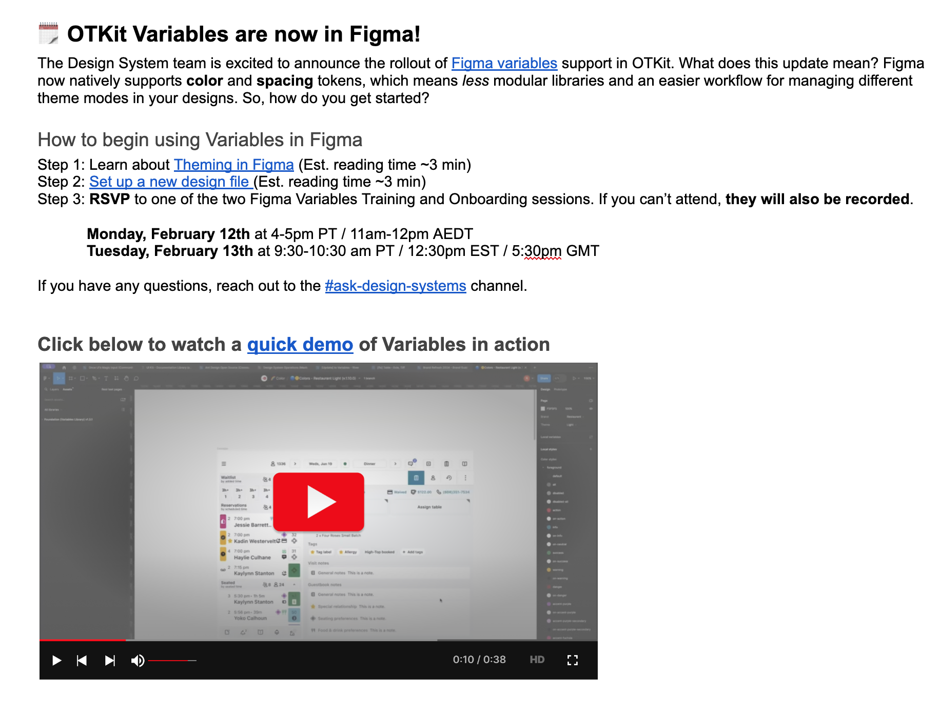 The OTKit newsletter kept teams aligned on system changes, deprecations, and new patterns.
Trust was built through follow-through. When teams reported issues, we responded quickly. When we made breaking changes, we migrated them. That responsiveness turned skeptics into advocates.
Reflection
The success of OTKit wasn’t the components—it was the shift in mindset.
The system became something teams relied on, not something they worked around.
That’s the difference between a library and a platform.