Overview
At Capital One, I led design systems strategy for a scalable decision-engine interface supporting analysts in compliance-sensitive, high-stakes environments. The work focused on transforming fragmented, spreadsheet-driven workflows into a modular, system-aligned interface that balanced speed, accuracy, and accessibility.
Note: Details have been intentionally abstracted to respect confidentiality while preserving decision-making and impact.
My role: Design Systems Lead
Scope: System strategy, component architecture, governance
Team: 2 designers, 2 PMs, engineering leads
Timeline: 5 months
The Problem
Analysts relied on a patchwork of spreadsheets and inconsistent UI patterns to define and manage complex decision logic. This resulted in:
- High cognitive load during rule creation
- Increased risk of error in critical workflows
- Inconsistent accessibility support
- Slow onboarding and poor pattern reuse across teams
The core issue wasn’t missing features—it was structural ambiguity.
Constraints
- Compliance-sensitive domain with low tolerance for error
- Legacy interaction patterns deeply embedded in daily workflows
- Multiple teams extending shared patterns
- Need for incremental migration rather than a full rebuild
Strategy
Instead of redesigning screens, I focused on establishing a clear system hierarchy that could scale across use cases and teams.
The approach:
- Define a progression from tokens → core components → reusable patterns
- Encapsulate complexity rather than exposing it
- Treat adoption and governance as design problems, not enforcement problems
This allowed teams to reason about complex logic consistently while retaining flexibility.
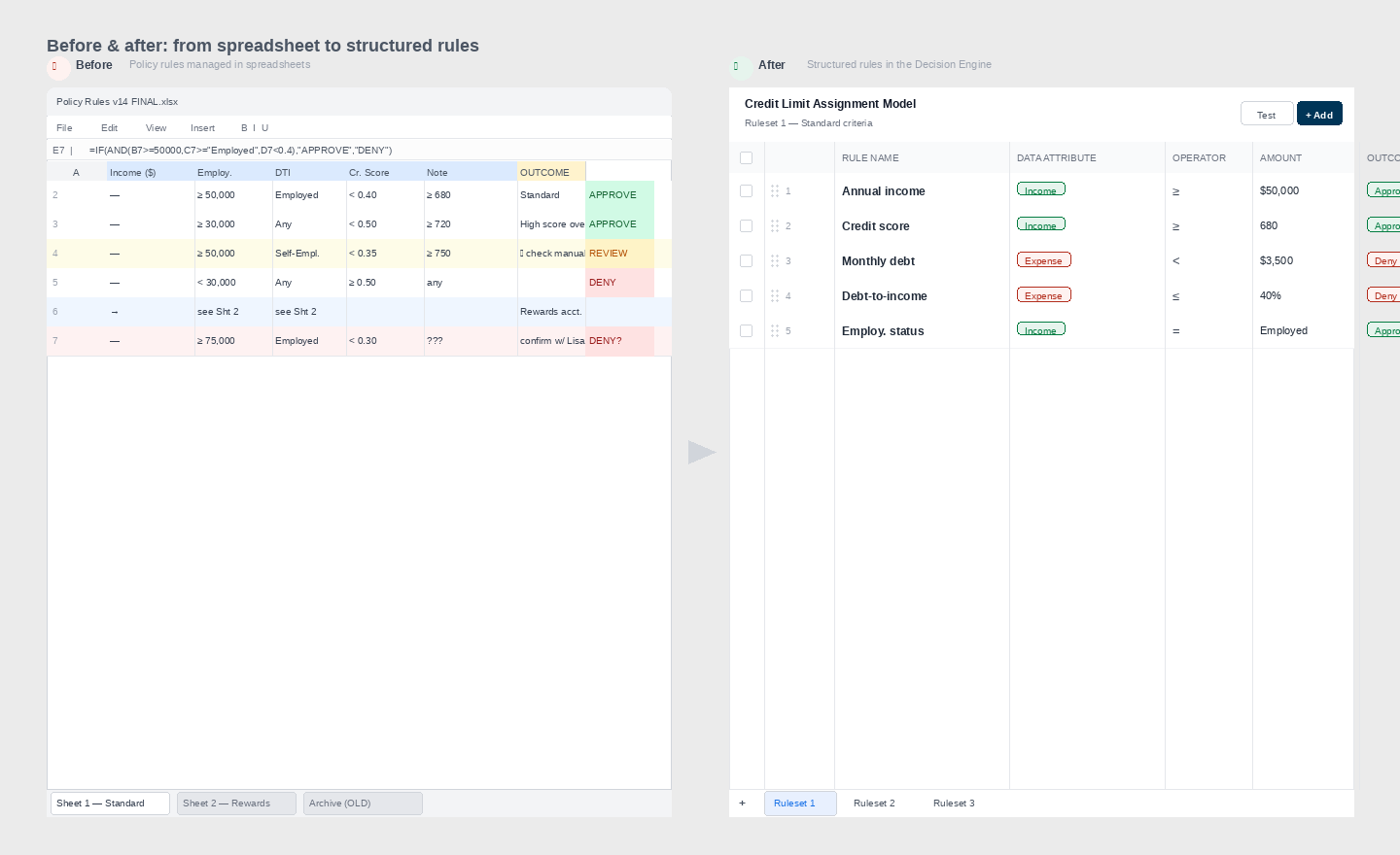
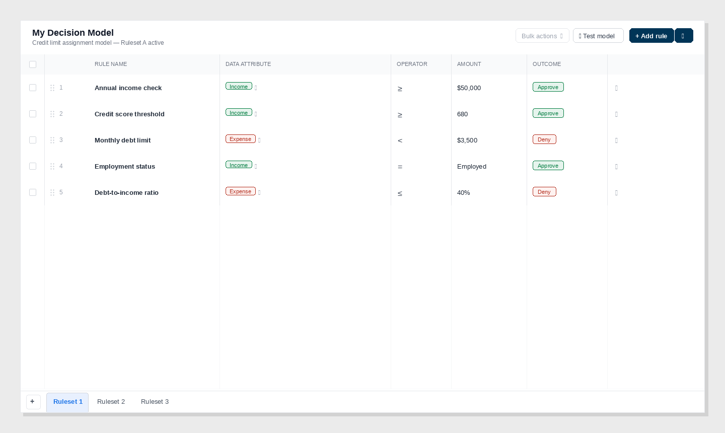
From Fragmentation to Modular Workflows
We replaced spreadsheet-style interfaces with modular workflows that made logic explicit and predictable.
Key decisions
- Centralized a shared component library as the single source of truth
- Defined repeatable interaction patterns for common analyst tasks
- Created a migration roadmap aligned to system maturity
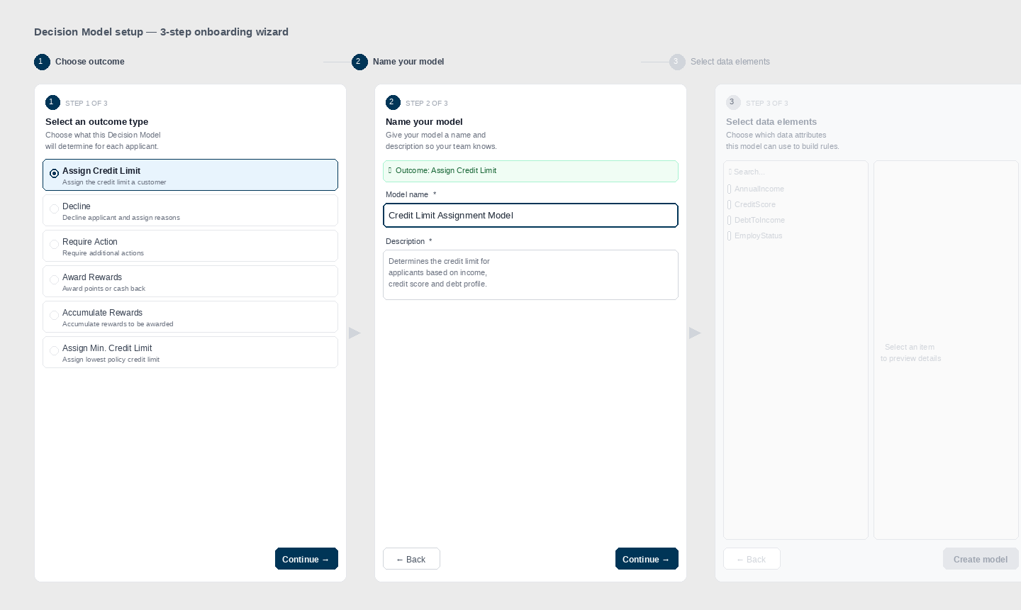
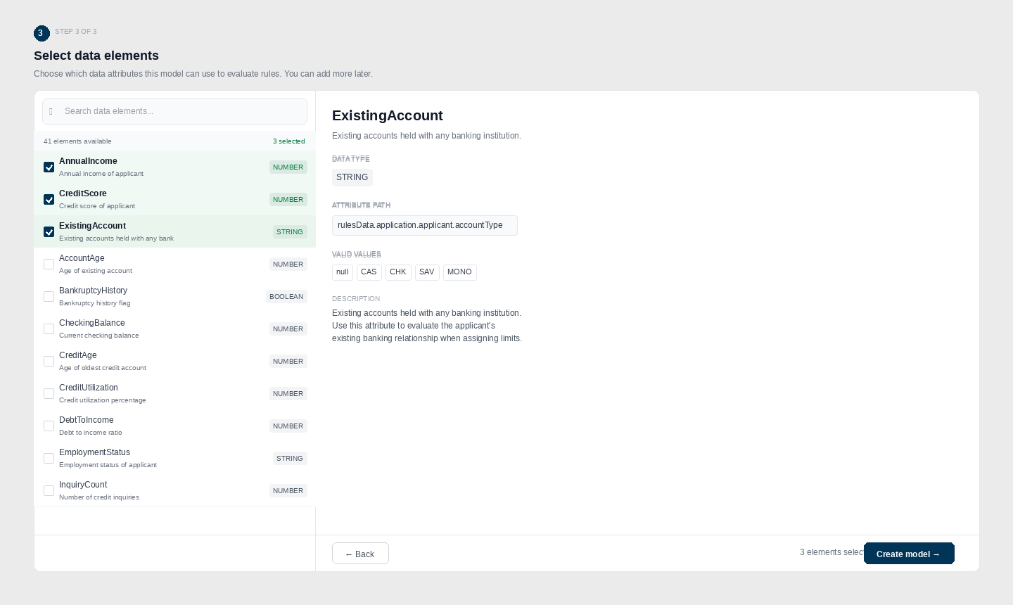
The onboarding wizard walked analysts through a three-step setup — choosing an outcome type, naming the model, and selecting the data elements it could evaluate.
Component Deep Dive: Rule Cell (Conceptual)
One critical interaction pattern encapsulated complex decision logic into a single, reusable unit.
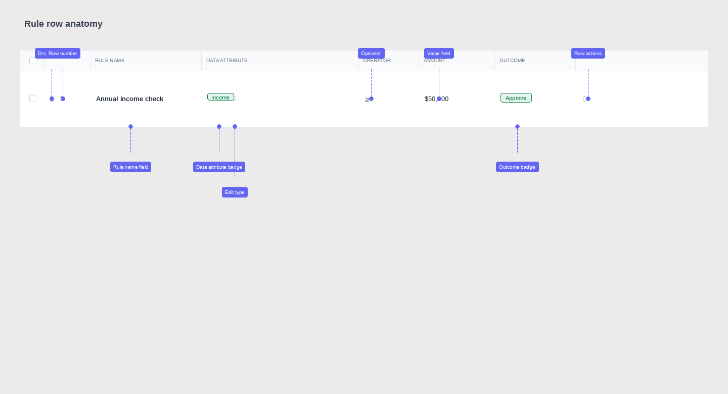
Design goals
- Surface upstream dependencies and validation states
- Reduce interaction cost for defining logic
- Support both novice and expert analyst behaviors
Each rule row maps a data attribute to an operator, a threshold value, and a decision outcome. The inline edit model — badge tap to swap attribute, dropdown for operator, direct input for value — eliminated the modal-heavy workflows analysts had been tolerating.
Impact
- Reduced interaction steps by ~63%
- Improved task-completion success in discovery testing
- Lowered error rates during rule creation
Accessibility as a System Lever
Accessibility improvements were embedded at the system level rather than treated as retrofits.
Outcomes included:
- ~30% improvement in accessibility compliance
- Clearer focus states and keyboard navigation
- More predictable interaction behavior across components
Accessibility became a forcing function for better structure and clarity.
Outcomes & Impact
- Unified interaction patterns across a critical enterprise workflow
- Faster analyst task completion in usability testing
- Reduced design and QA overhead through shared tokens and components
- Established a scalable foundation for future platform growth
Next Iterations
- Expand the component library to support new data interaction models
- Refine token architecture for faster theming and dark mode support
- Deepen async contribution rituals to scale governance sustainably
Reflection
In complex enterprise systems, clarity is a performance feature.
This work reinforced that scalable UX isn’t about simplifying problems—it’s about making complexity legible.